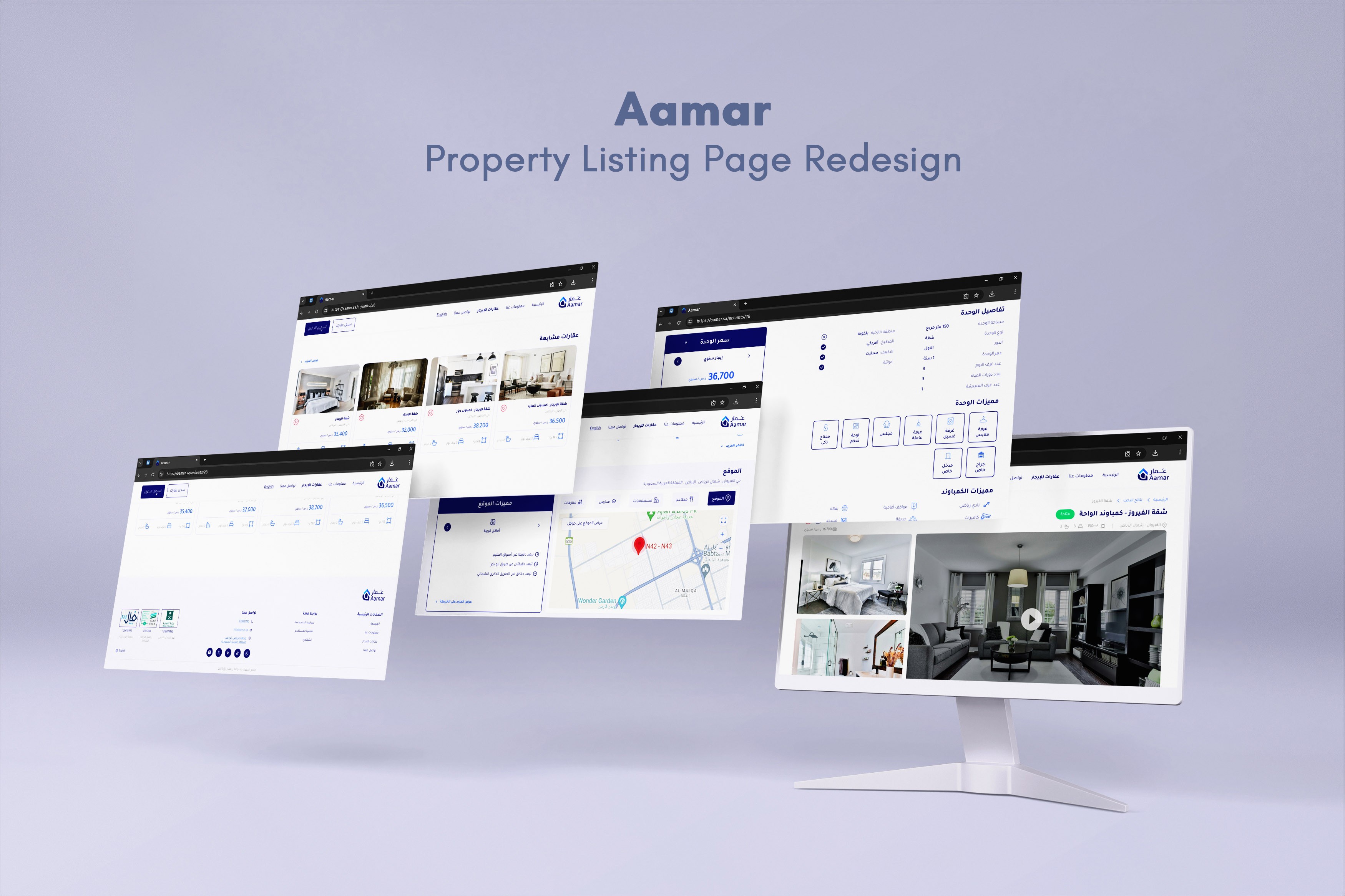
Case Study - Redesigning a Property Listing Page
Aamar Real Estate empowers property owners and those searching for rental units to interact with confidence and transparency through an innovative platform, benefitting from online brokerage and marketing services.
The current design of the property listing page contains a lot of information about the unit details, which Aamar wants to simplify and present in a user-friendly and visually appealing way.
The goal is to improve the user experience and visual design, making it easier for potential renters to view property details, watch videos, see images, understand pricing, and take actions such as scheduling a visit or renting the property.
Role
UX UI / Visual Designer
Timeline
1 Week
Tools
Figma, Canva, Photoshop
Challenge
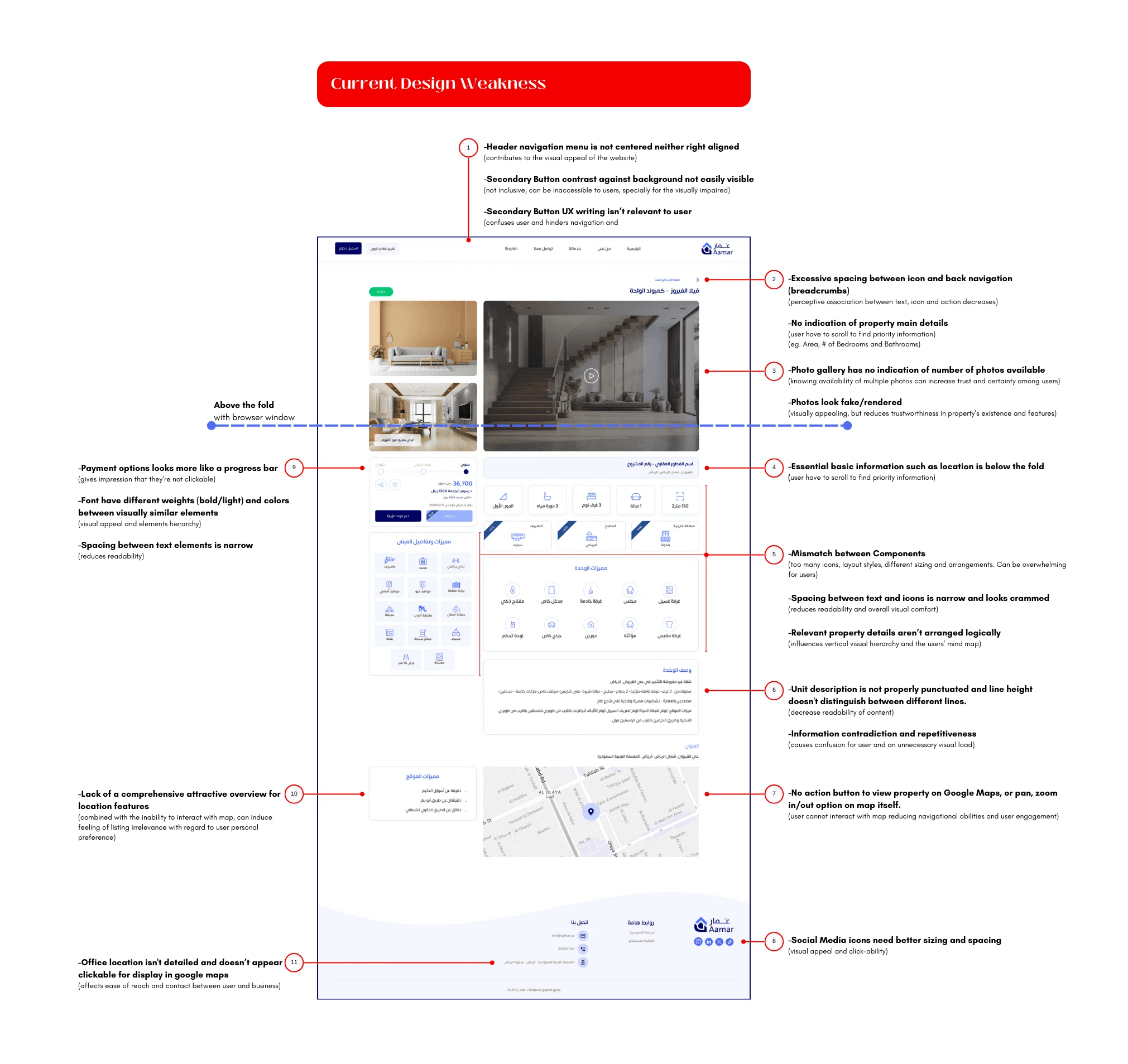
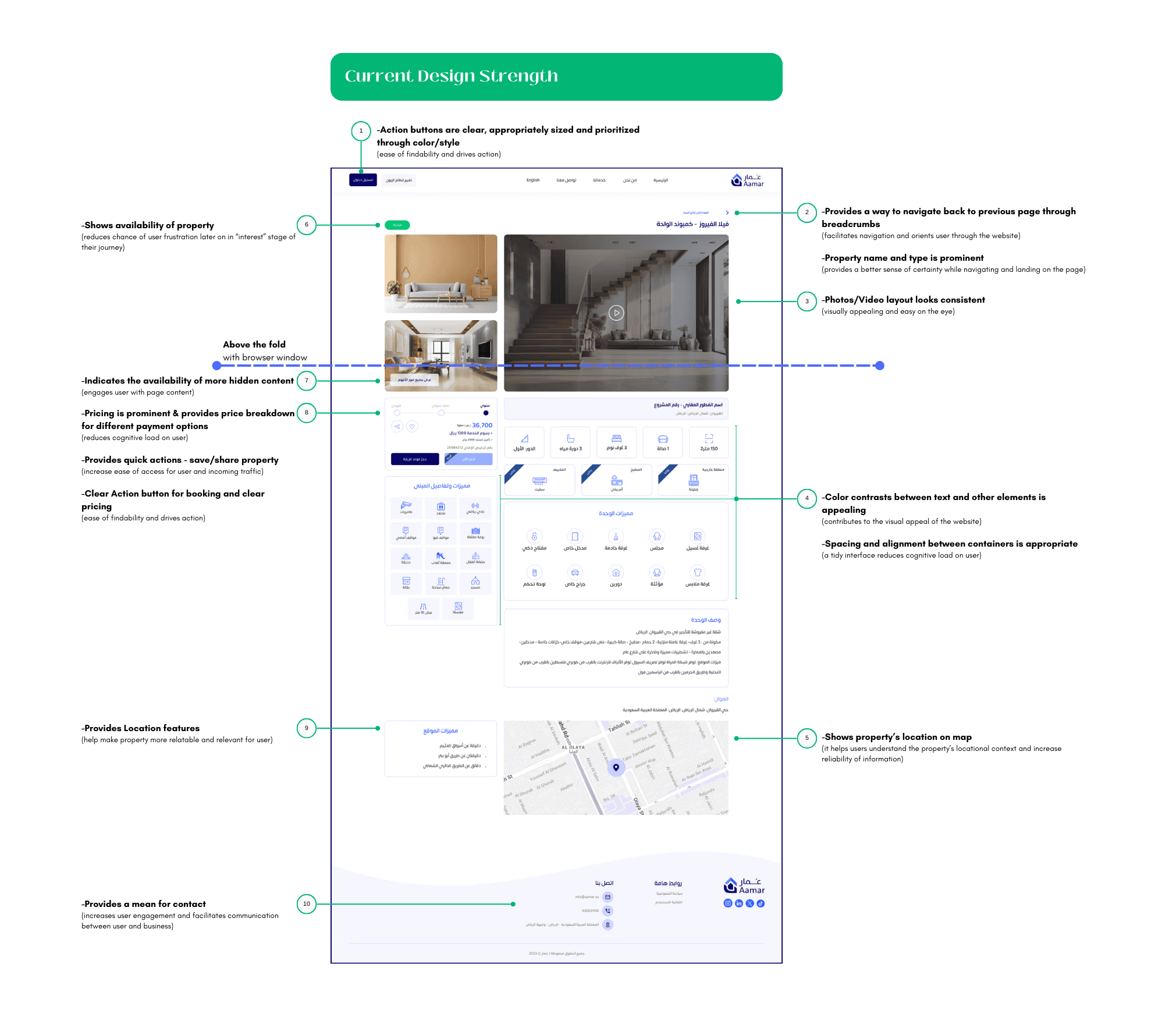
The property listing page had a crammed interface filled with different component styles, icons and text arranged in an inefficient visual hierarchy, making it difficult to navigate.
The design was challenging in terms of delivering a huge amount of details about the unit while maintaining a clear visual hierarchy, a comprehensive content and a clean interface that's intuitive to navigate.
Results
The redesigned page features a clean, clutter-free interface, with a structured visual hierarchy, making it easier for users to navigate between property information sections and directing their attention to important CTA's.
The addition of a personalization section and interactive components enhances user engagement, which can lead to an increase in user retention rates.
Evaluating the Current Design
I've identified the strengths and weaknesses of the current design, covering aspects such as layout, navigation, visual hierarchy, usability, and overall user experience.
Who Are The Competitors
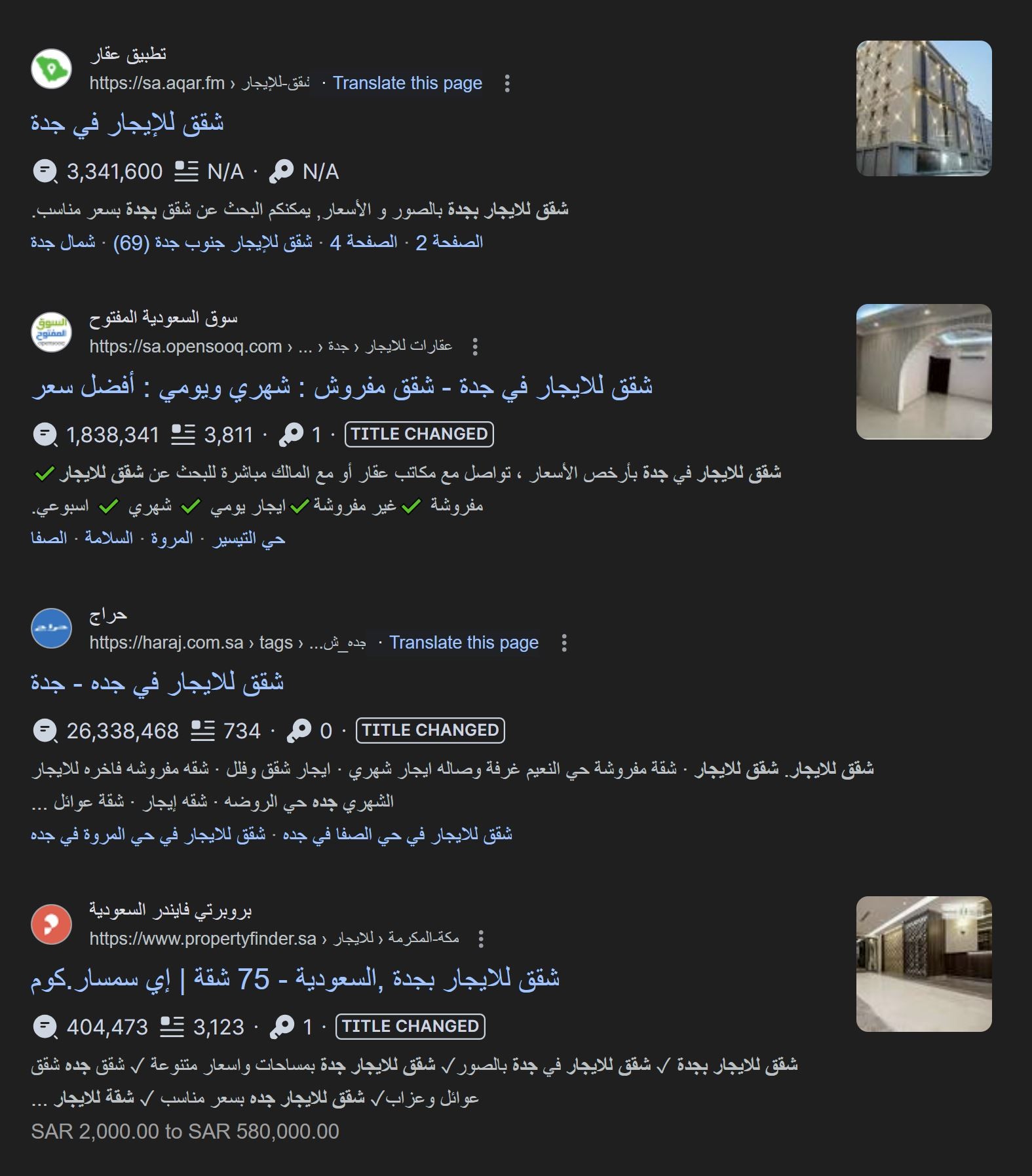
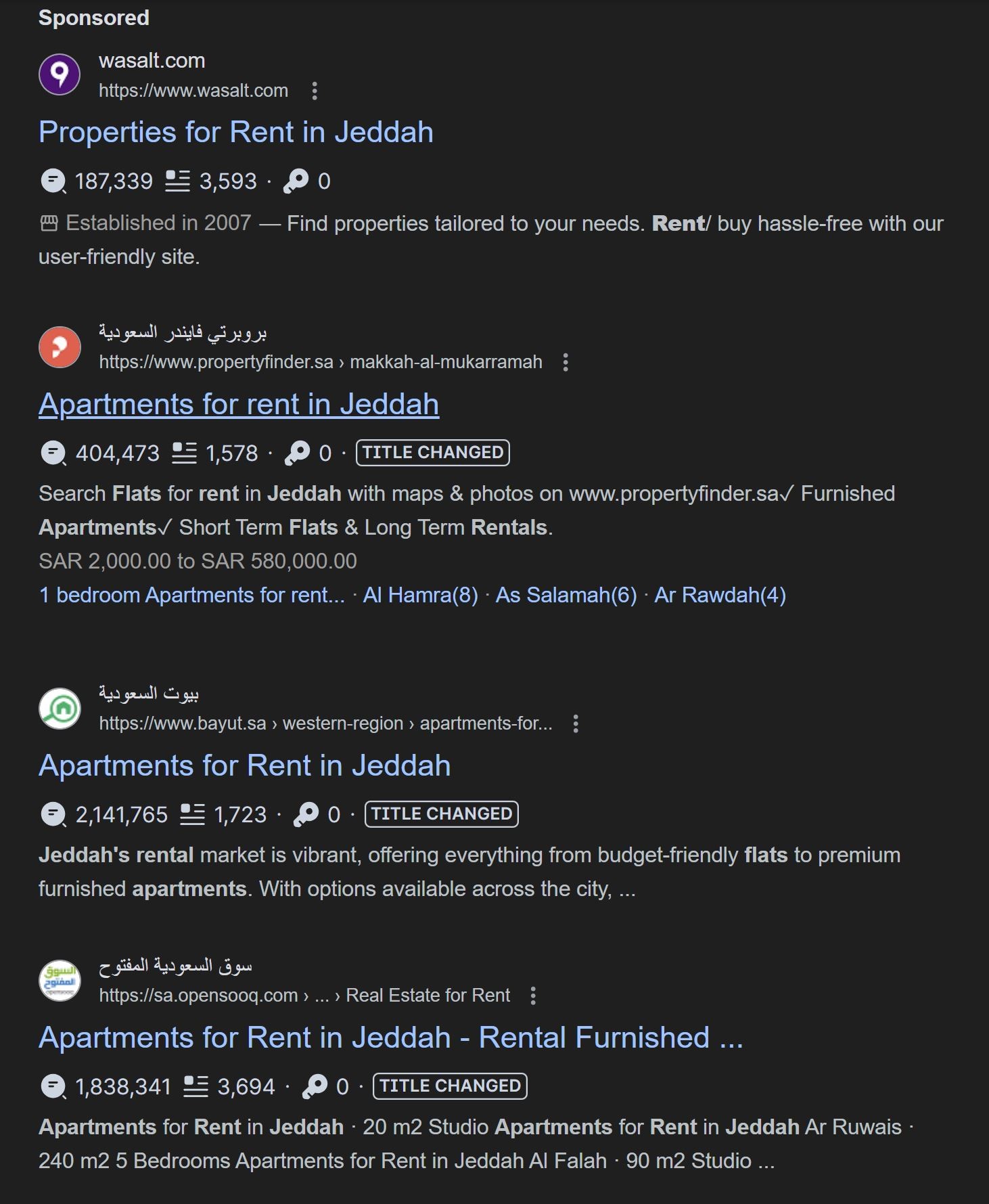
Competitors were decided based on Google Direct Search results for properties for rent in Saudi Arabia (inputs were tested with different inquiry formats). A browser plug-in was also used to identify amount of traffic to the websites ranking top on Google Search page. This search was conducted using both English and Arabic inputs.
Based on this criteria and the similarity in functions/services between Aamar and competitors website, the following websites were chosen for comparison:
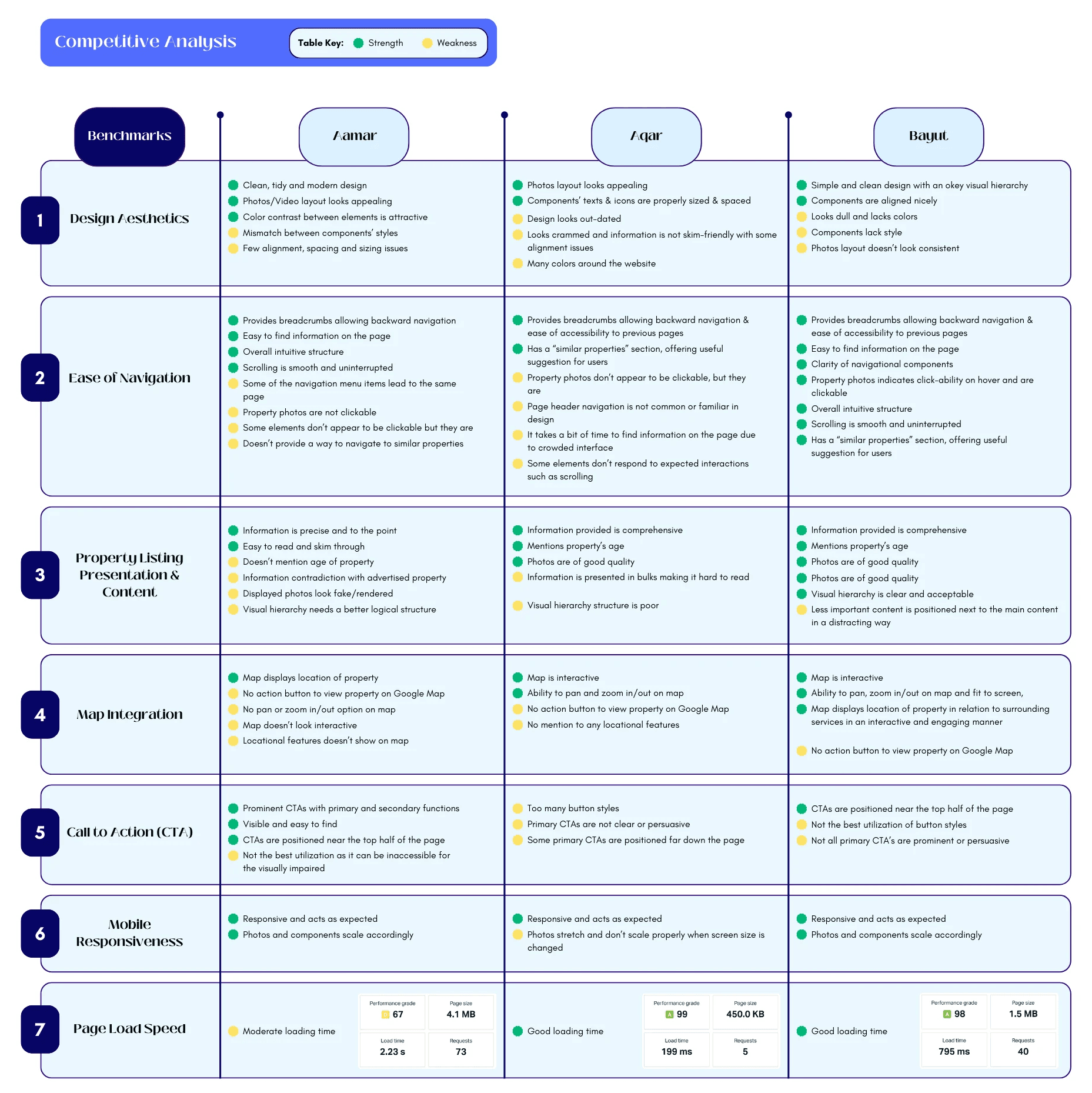
Defining Benchmarking Points
Design Aesthetics: How visually appealing is the website? Is it modern and clean, or does it feel outdated?
Ease of Navigation: How easy is it for users to find what they’re looking for? Is the site’s structure intuitive?
Property Listing Presentation & Content: How are the property listings presented? Are the photos high-quality? Is the information clear and comprehensive?
Map Integration: How well is the map view integrated into the site? Is it easy to use and helpful for users?
Call to Action (CTA): How compelling are the CTAs? Are they clearly visible and persuasive?
Mobile Responsiveness: How well does the website perform on different devices, especially mobiles?
Page Load Speed: How quickly do the pages load? Slow load times can frustrate users and lead to higher bounce rates.
Competitive Analysis
In the following table, I have identified 2 competitors of similar platforms to Aamar, with property listing pages, and performed a benchmark analysis comparing the current design with these competitors using the above benchmarking points.
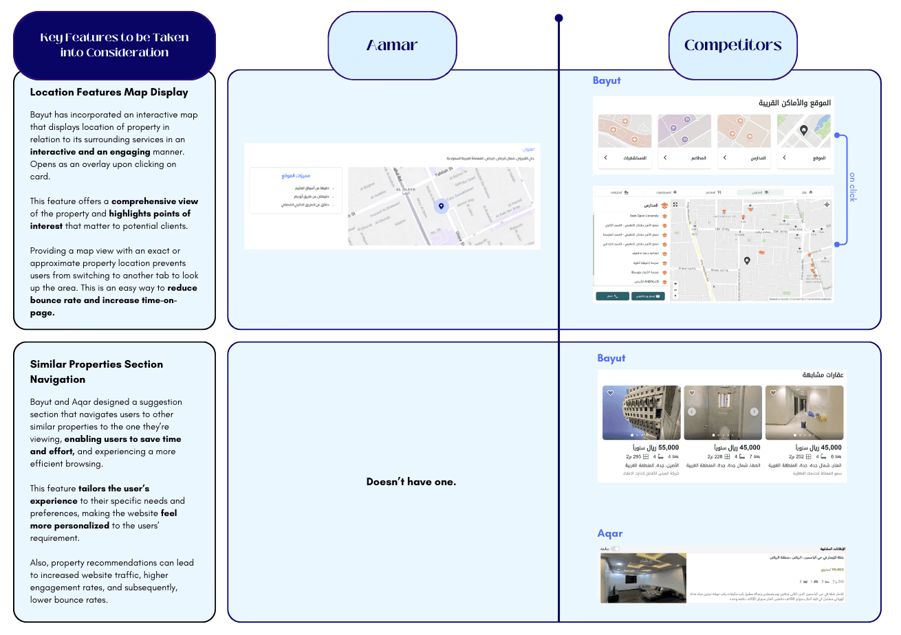
In the following section, I have also highlighted key features, design elements, and user experience aspects from the competitors that could inform the redesign of the property listing page.
Key Features, Design Elements, and User Experience aspects
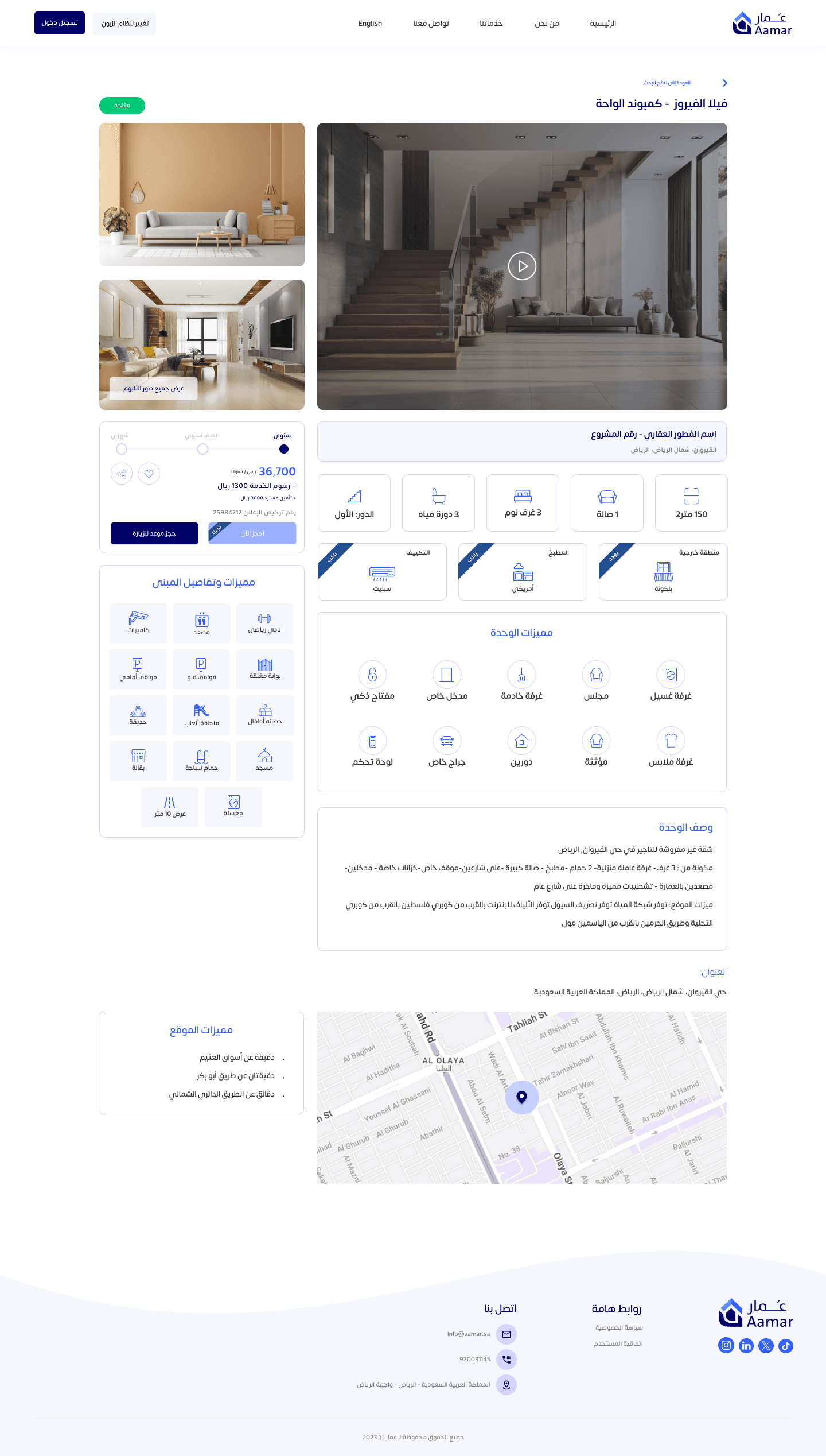
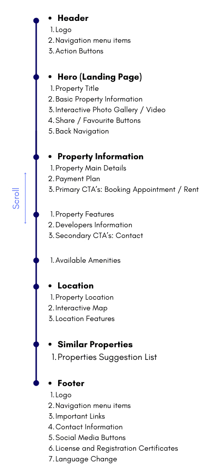
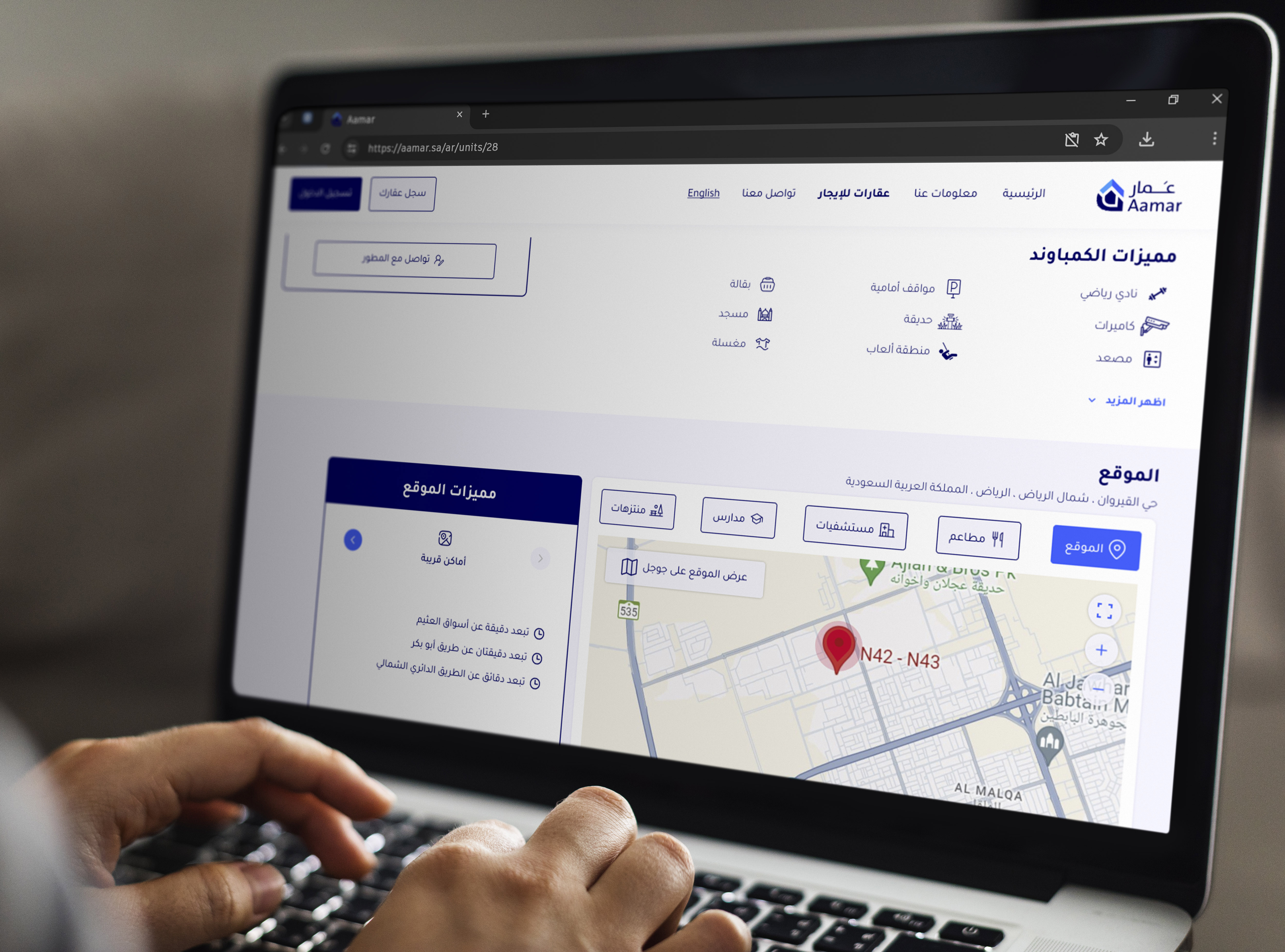
How The Page Will Be Sectioned
Main Sections in a Property Listing Layout:
Header
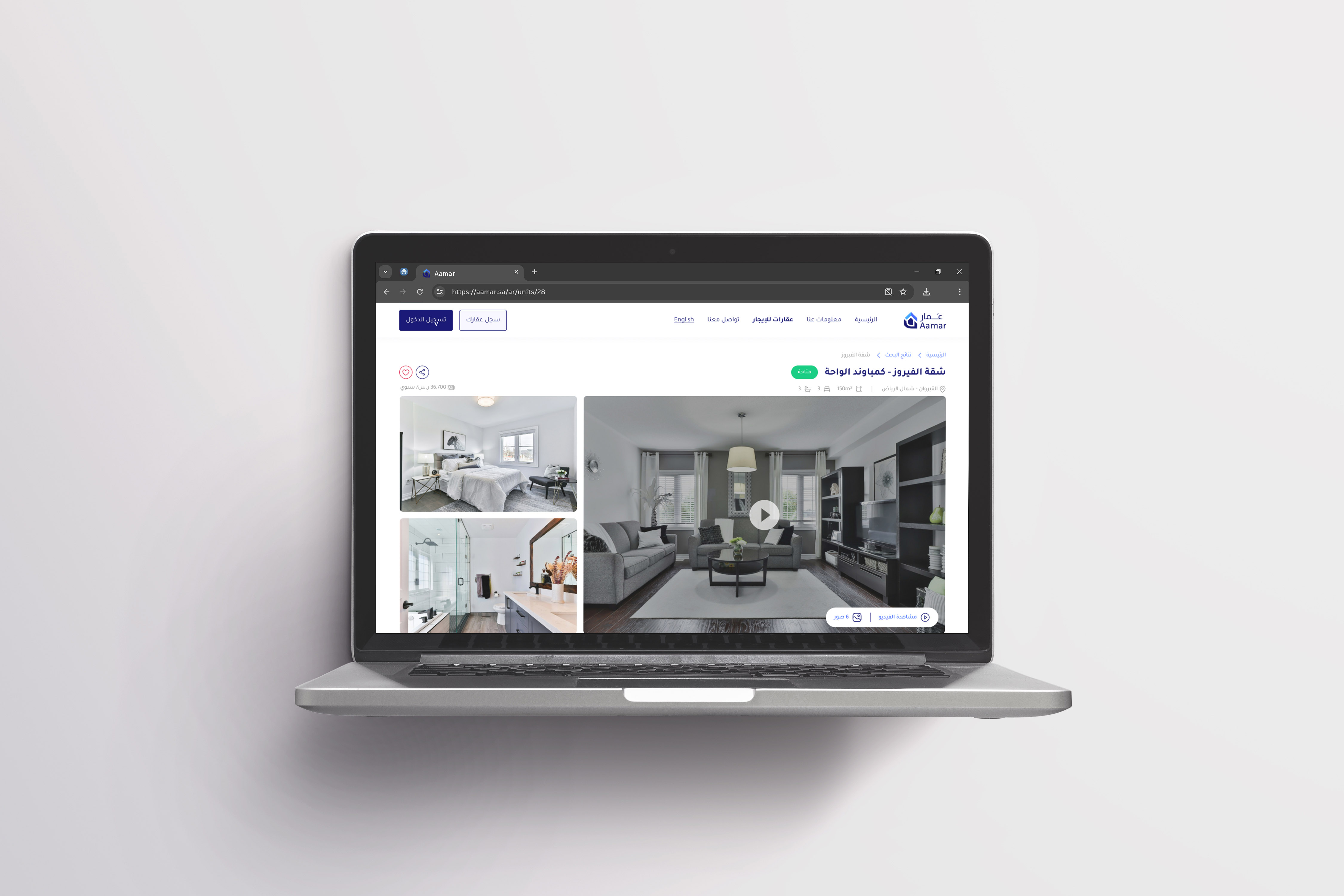
Photo Gallery
Property Information
Unit Amenities
Community Amenities
Payment Plan
Book Appointment / Contact
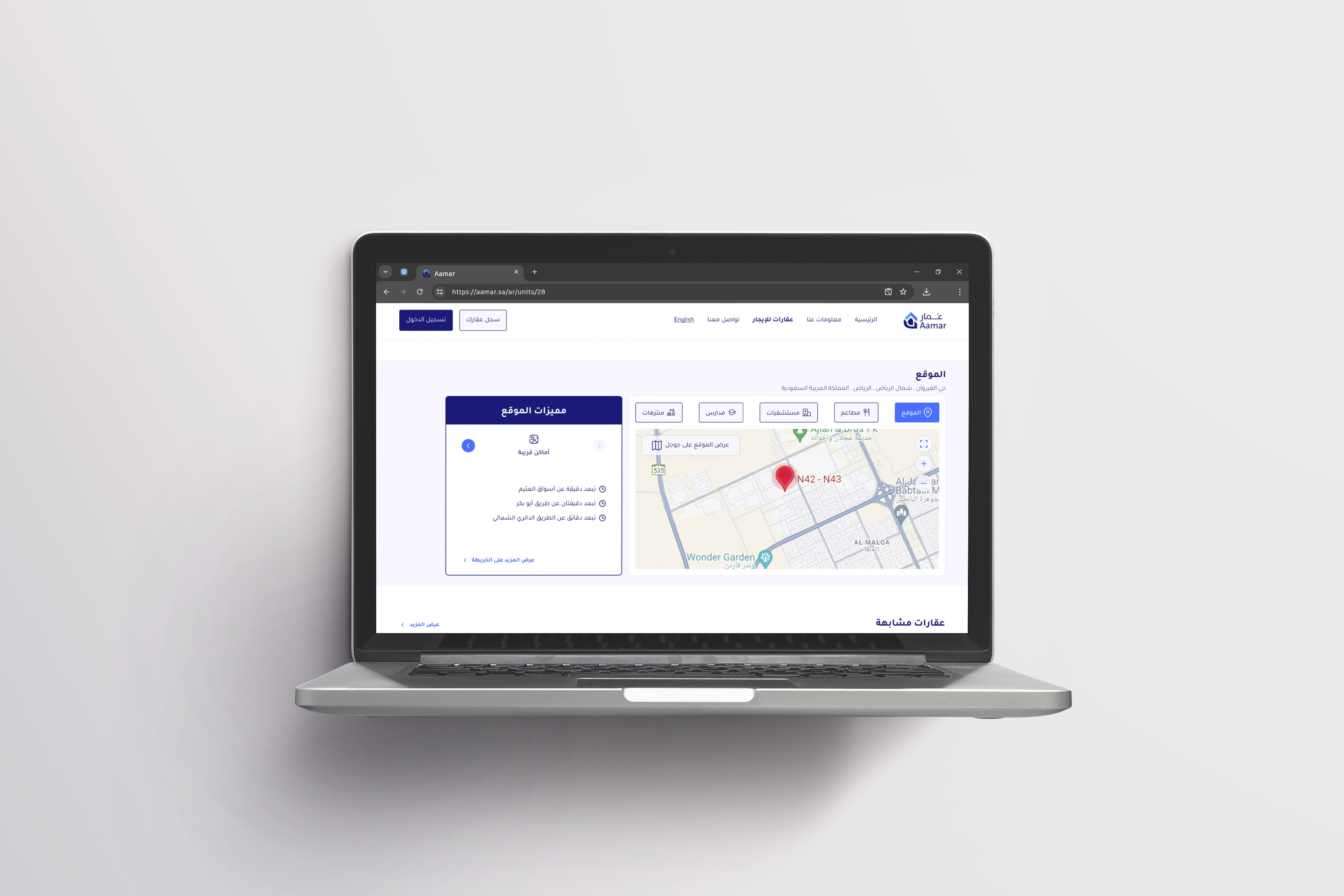
Location (Map)
Location Features
Similar Property Suggestions
Footer
Design Decisions
In the redesigned page, I’ve made strategic choices to enhance user experience and engagement:
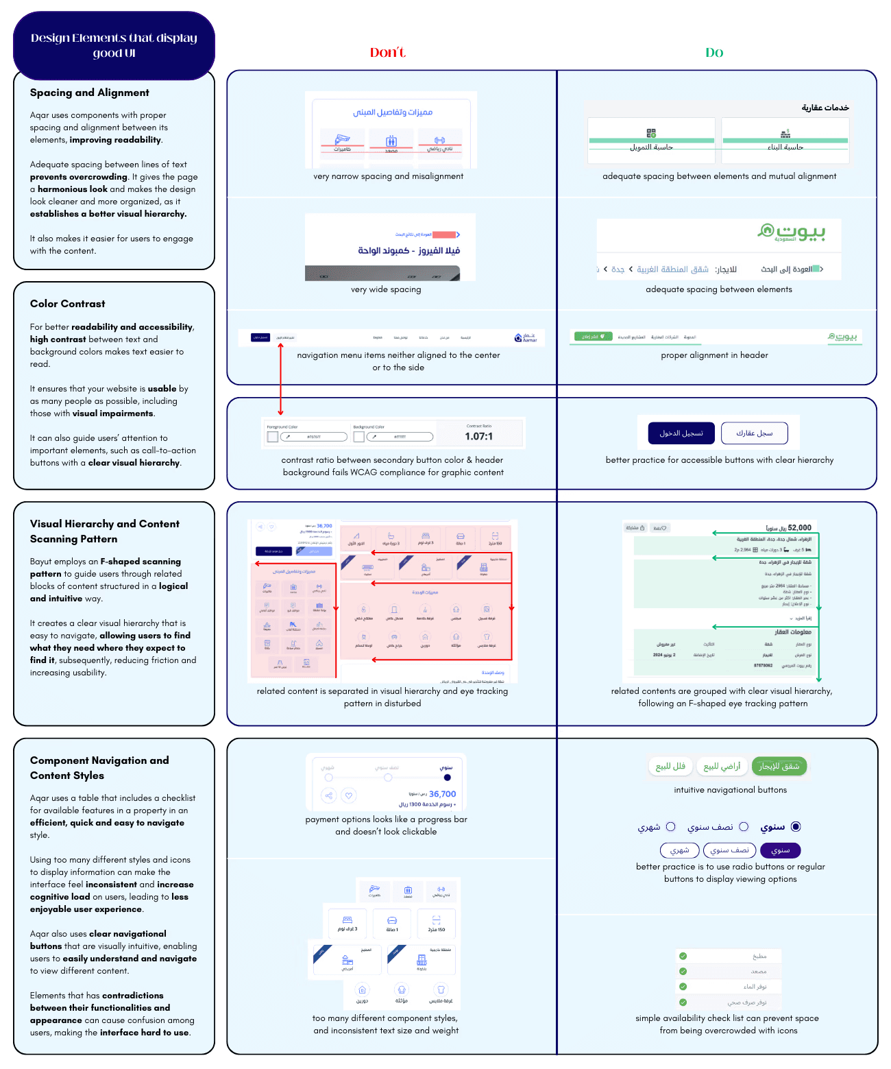
Proper spacing and alignment in the design improve readability and visual hierarchy, making it easier for users to engage with the content. The use of the F-shaped scanning pattern guides users through related content in a logical and intuitive manner, reducing friction and increasing usability.
The checklist table for property features and clear navigational buttons enhance user understanding and ease of navigation. High contrast between text and background colors improves readability and ensures the website is accessible to a wider audience, including those with visual impairments. These design elements guide users’ attention to important elements like call-to-action buttons, creating a clear visual hierarchy.
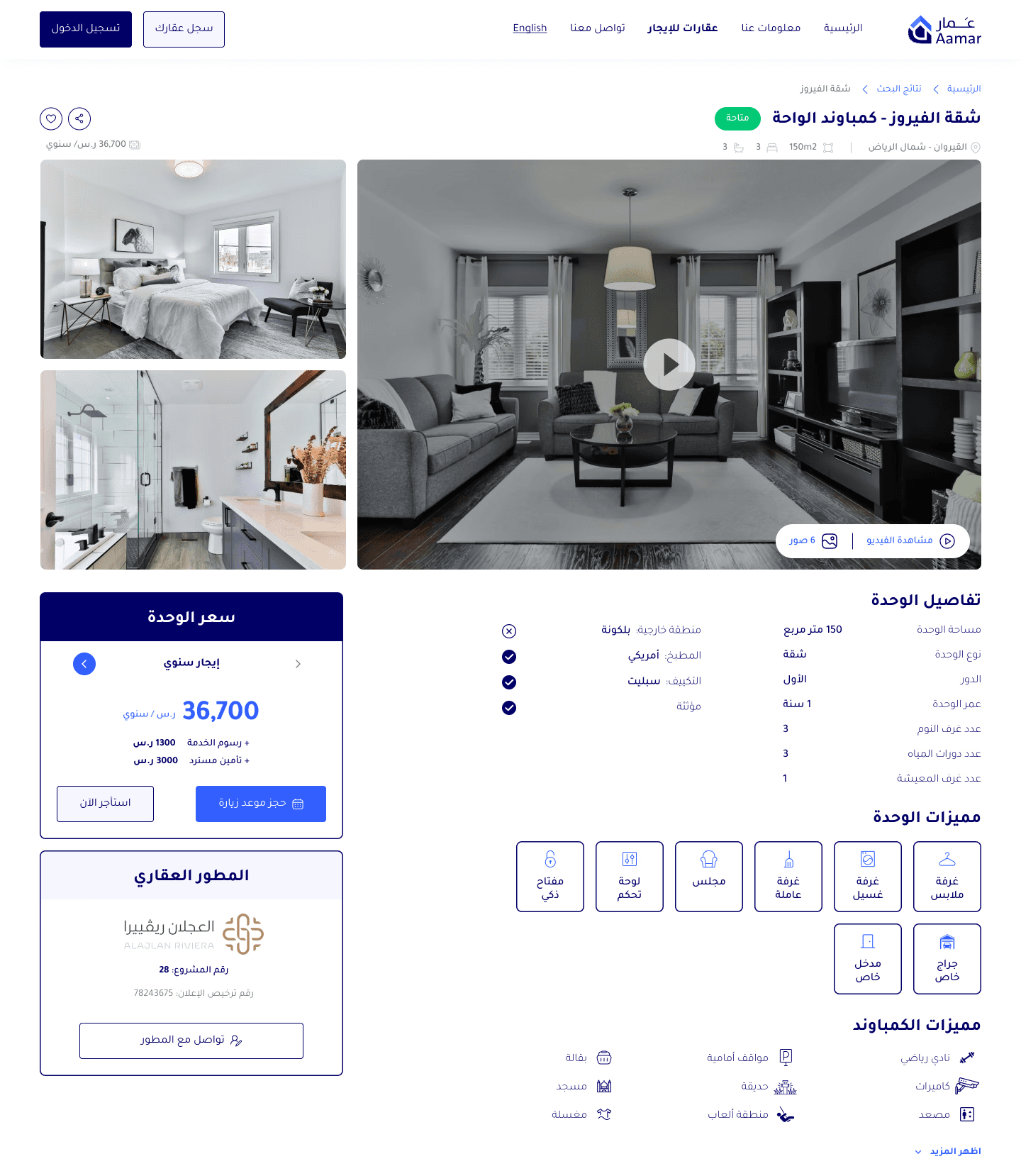
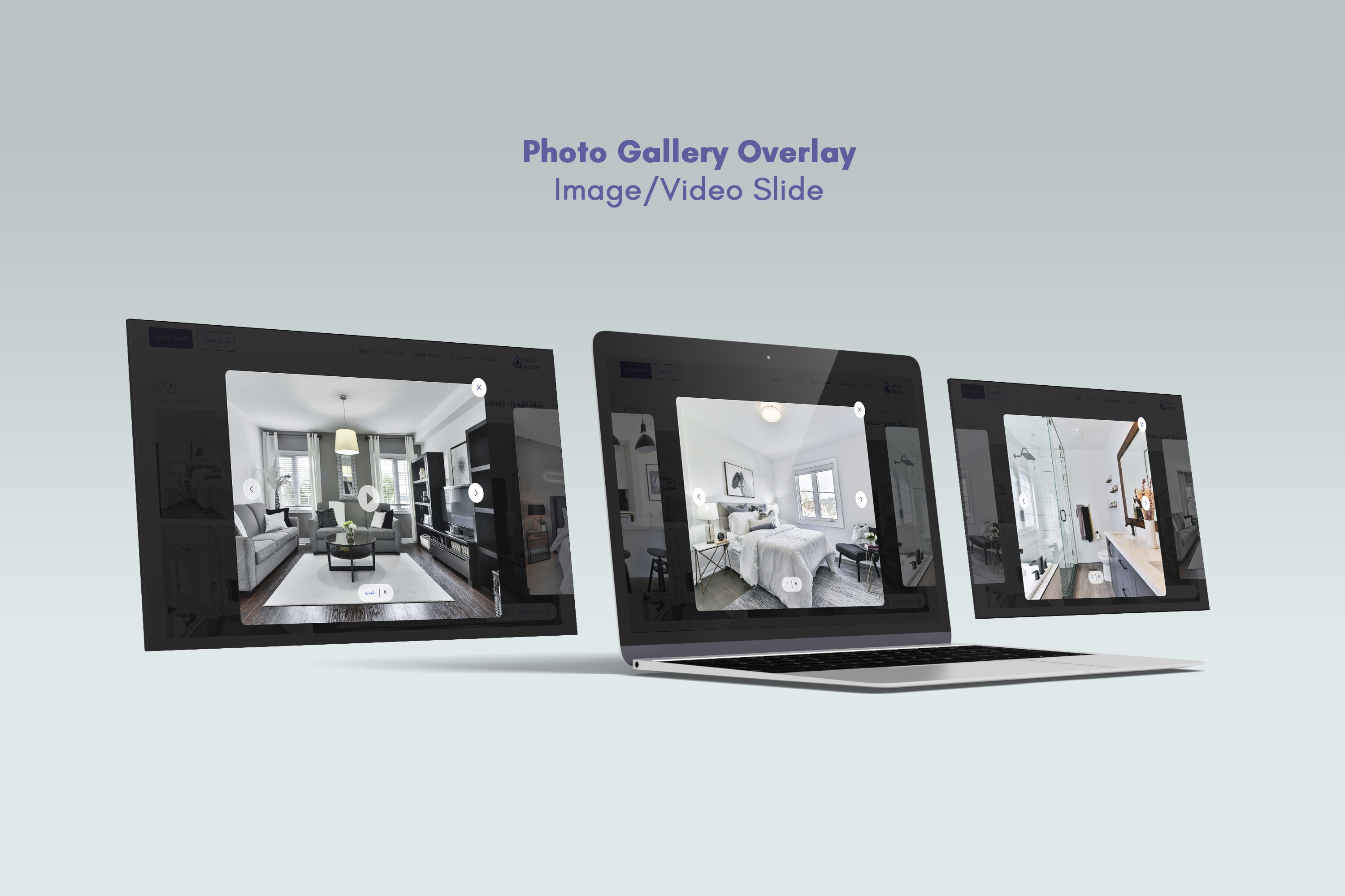
Incorporating a photo overlay that provides users with access to more property photos, coupled with a hover interaction on gallery photos, signaling to users that a photo is clickable; significantly enhances the user experience by reducing user uncertainty and making the interface more intuitive, while providing a more immersive and interactive way to view property photos.
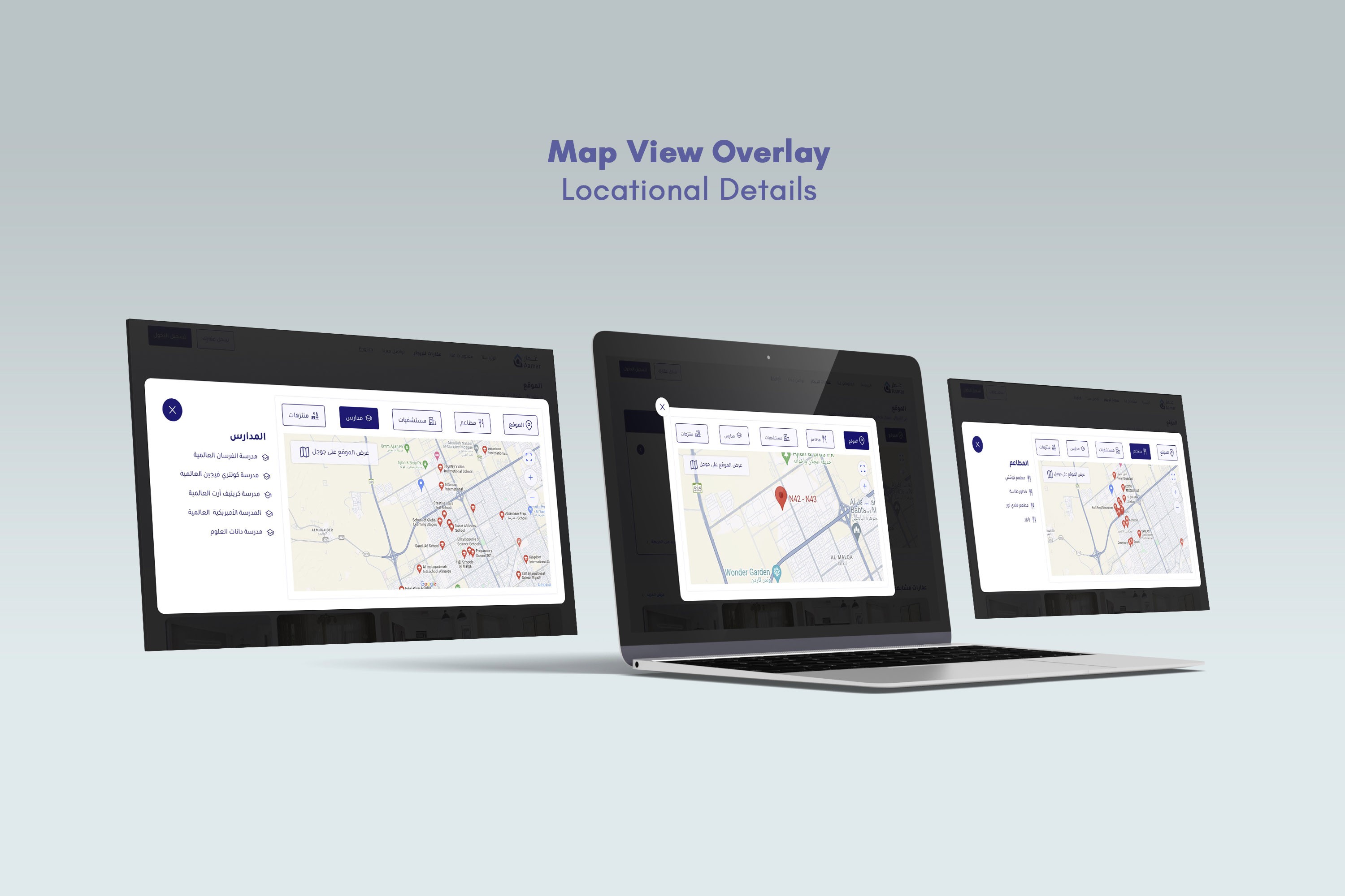
In parallel, incorporating an interactive map overlay on the property listing page provides users with a detailed view of the property and its surroundings, keeping users engaged and reducing the need to navigate away.
Adding a suggestion section, which recommends similar properties, personalizes the user experience, potentially increasing website traffic and engagement rates.
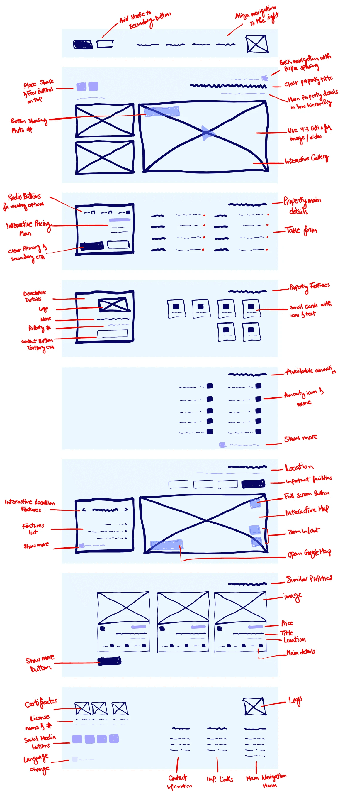
Low-Fidelity Prototyping
High-Fidelity Prototyping
User Flow Diagram
This diagram explains how users will navigate through the redesigned page, starting from landing on the page, going through the process of checking images/videos, property details, pricing plans, location and amenities, and ending with a decision to book an appointment, rent now or look for similar properties.
Visual Style and Elements
I used the 8px grid system for designing components, iconography, typography and spacing. I sized them proportionally, with the height as a multiple of 8 (16px, 24px, 32px, and 48px). While the rest of the components' followed the grid system's lines, where the interface was divided into 12 columns, with margins of 56px and gutters of 16px.
High-Fidelity Mock Ups
Conclusion
Overall, these informed web design choices aim to improve user experience, reduce cognitive load, and make the interface more enjoyable and easy to use.
By focusing on the user’s needs and preferences, this design ensures that the property listing page is not only visually appealing but also highly functional and user-friendly. This user-centric approach to web design is key to creating a successful and engaging property listing page.