E-commerce Website Redesign
Overview
Skicho is an ecofriendly eCommerce fashion brand aspiring to change the way people think about the clothes they wear.
After launching their website and running campaigns, they’ve been struggling with acquiring customers. The website was facing usability issues that led to a high bounce rate and a decline in engagement.
My goal was to redesign the website, improving its UI to provide a seamless, intuitive, and enjoyable experience for users, ultimately increasing user engagement and satisfaction.
Role
Timeline
Tools
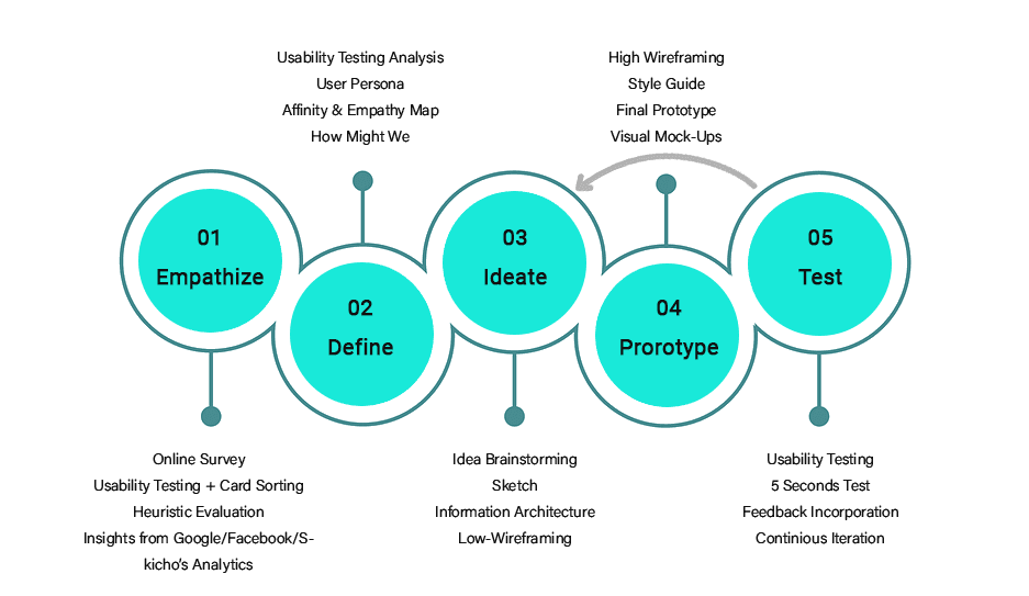
Process
Challenge
Growing attached to one's design and subduing personal preferences.
Trusting the process and prioritizing user's feedback taught me how to have a non-biased method of conducting studies and applying design solutions that will eventually benefit the business and increase users' satisfaction.
Results
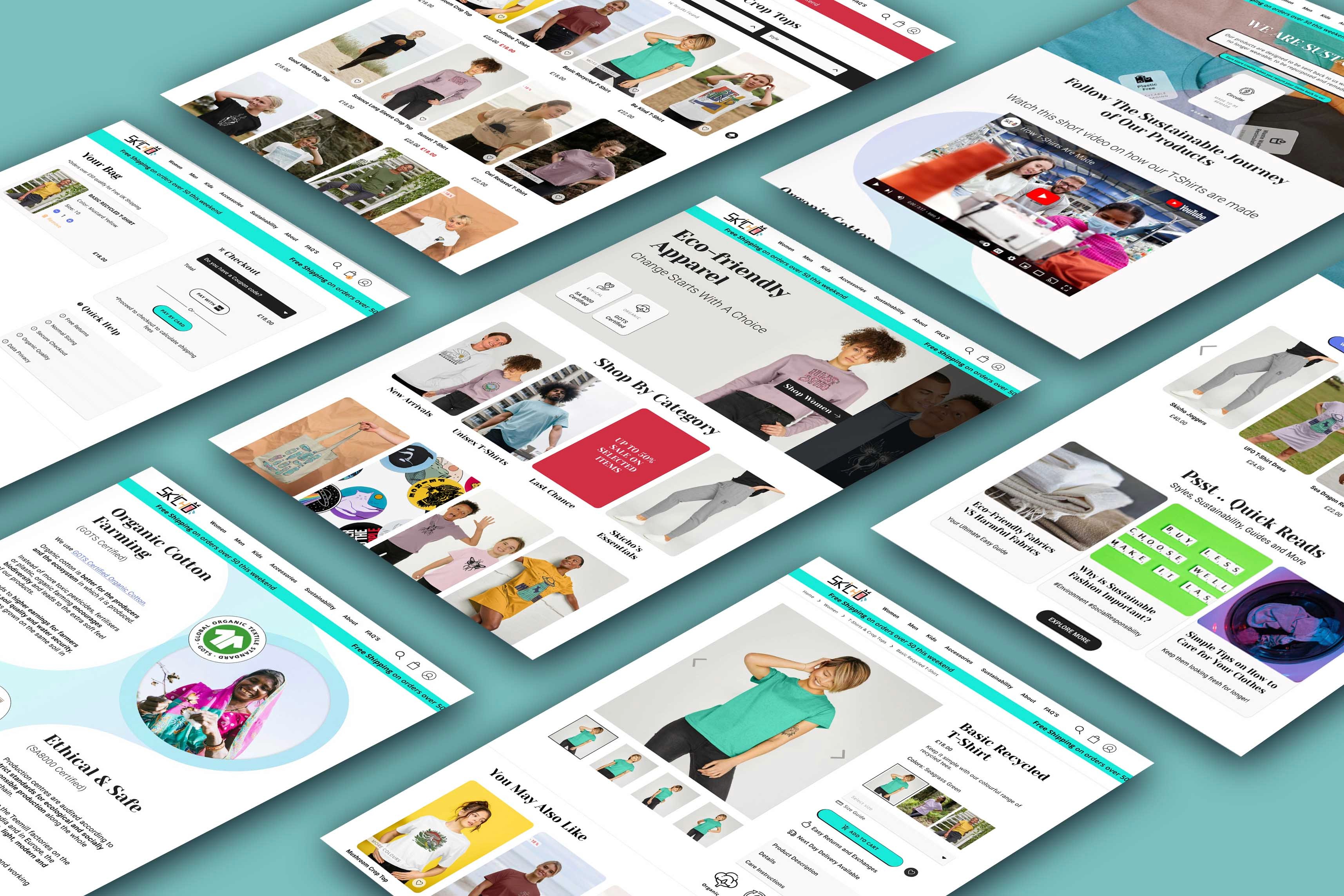
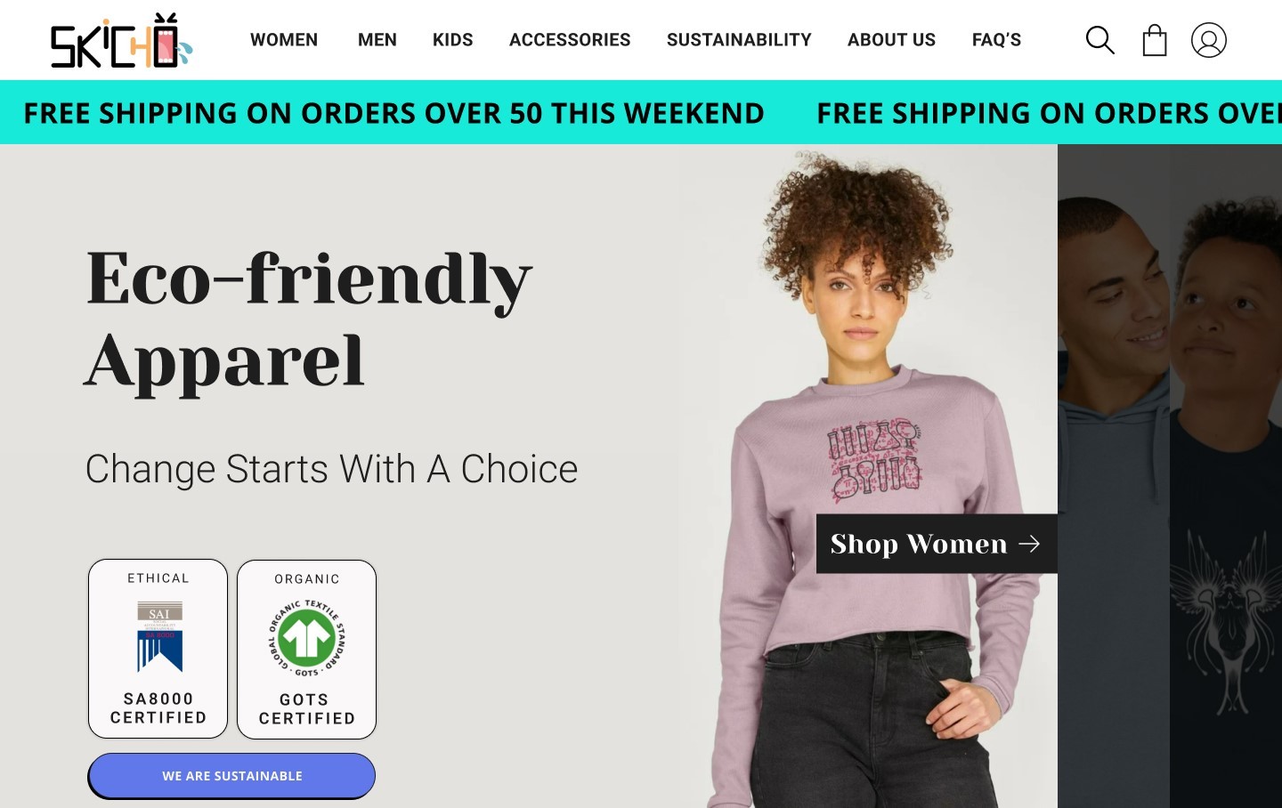
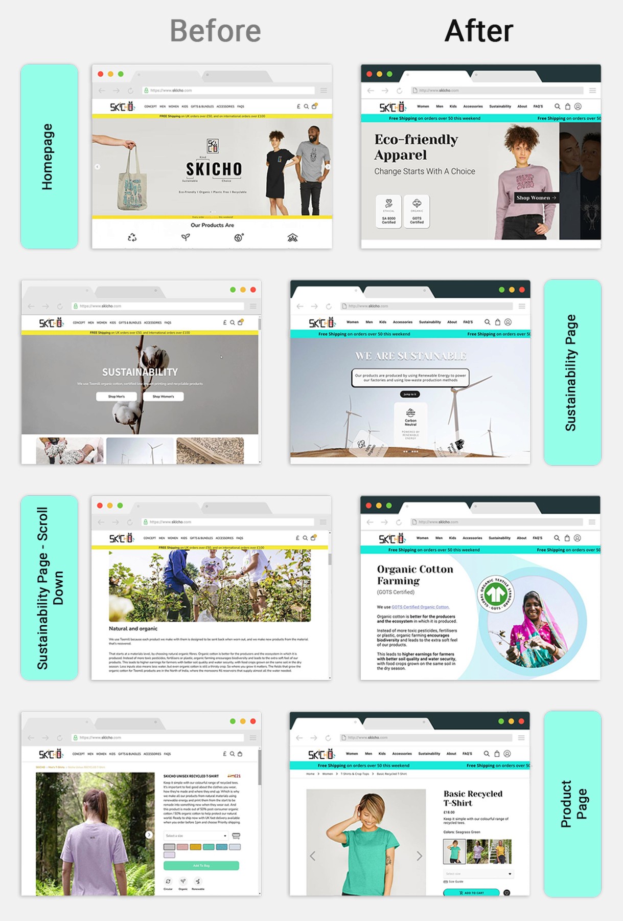
The redesigned website features a clean, clutter-free interface, making it easier for users to navigate and access essential features.
Because users were now able to find information easily and surf the website with more sense of trust, usability testing showed an increased engagement with the website and a higher satisfaction with the experience.


Problem
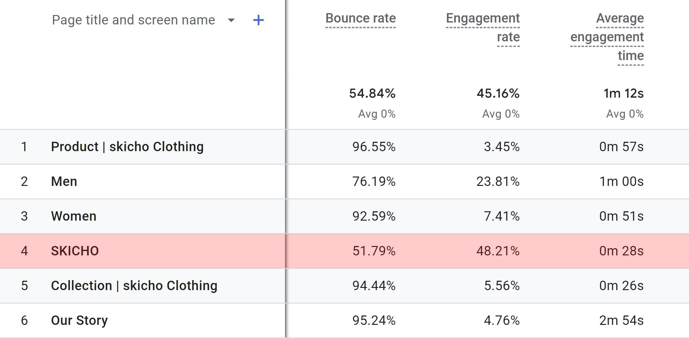
The latest statistics indicate an average eCommerce bounce rate of 45.68%. Generally, eCommerce and retail sites exhibit bounce rates between 20% and 45%, which is considered normal. In contrast, Skicho's website experiences a higher bounce rate, leading to insufficient sales.
Hypothesis
By utilizing engagement metrics sourced from Google Analytics, I hypothesized that:
‣ Users either landed on pages that don’t reflect the brand’s identity/expected content,
‣ or Navigating the website failed to offer a seamless user experience and a smooth user flow.
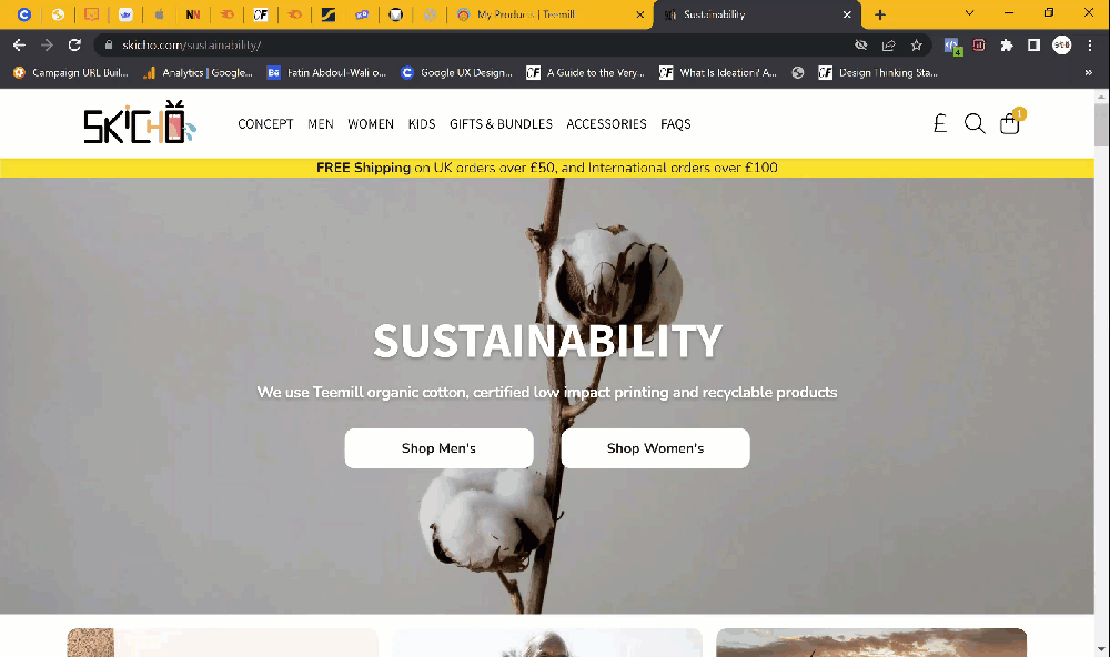
To validate this supposition, I conducted usability testing and revamped the web interface and experience based on user feedback.
Quantitative Data
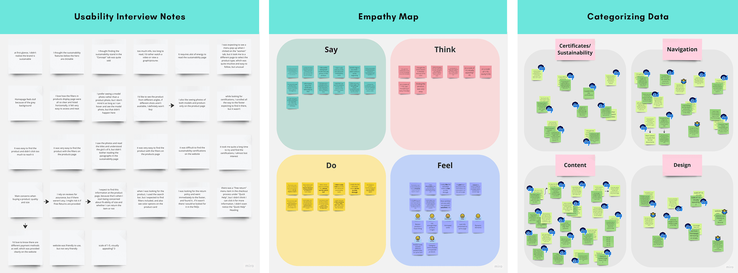
Qualitative Data (Usability Testing Results)
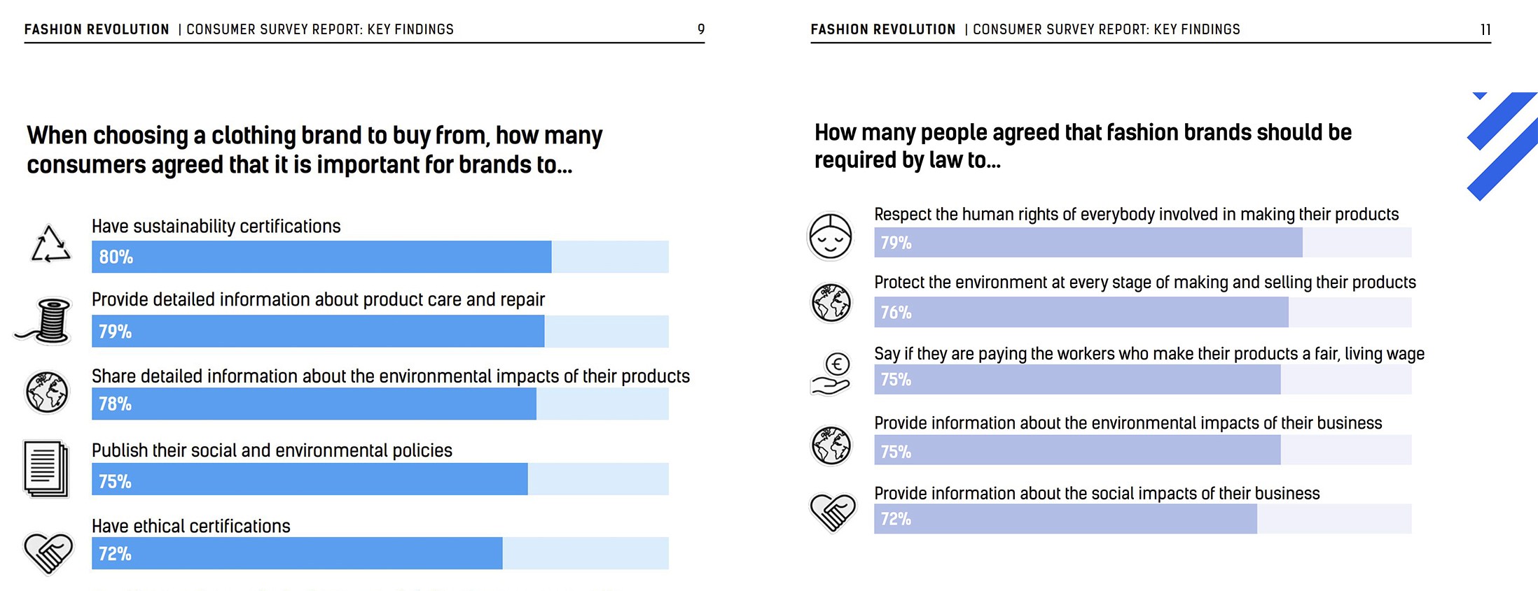
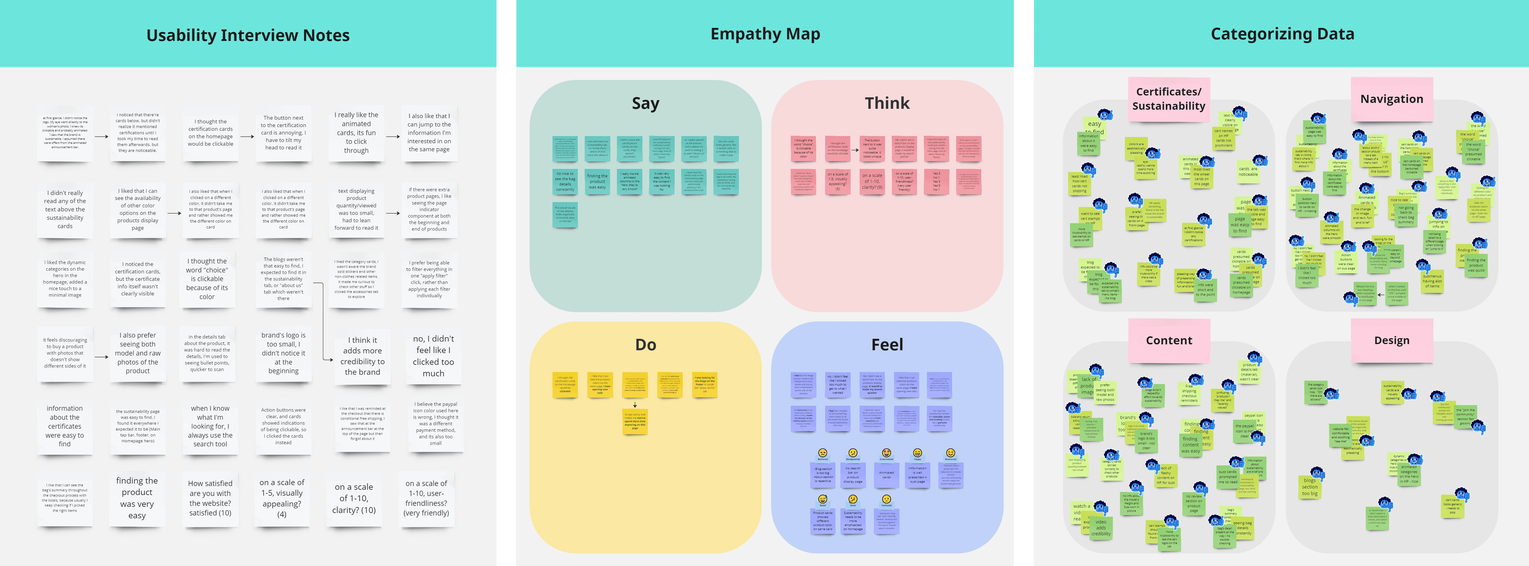
I interviewed potential users, and all participants are between the age of 25 - 45 years old. By utilizing usability notes, empathy mapping and categorization of data, I discovered that all users have similar approaches in navigation and a shared problem of trust when it came to the displayed content, which are as follows:
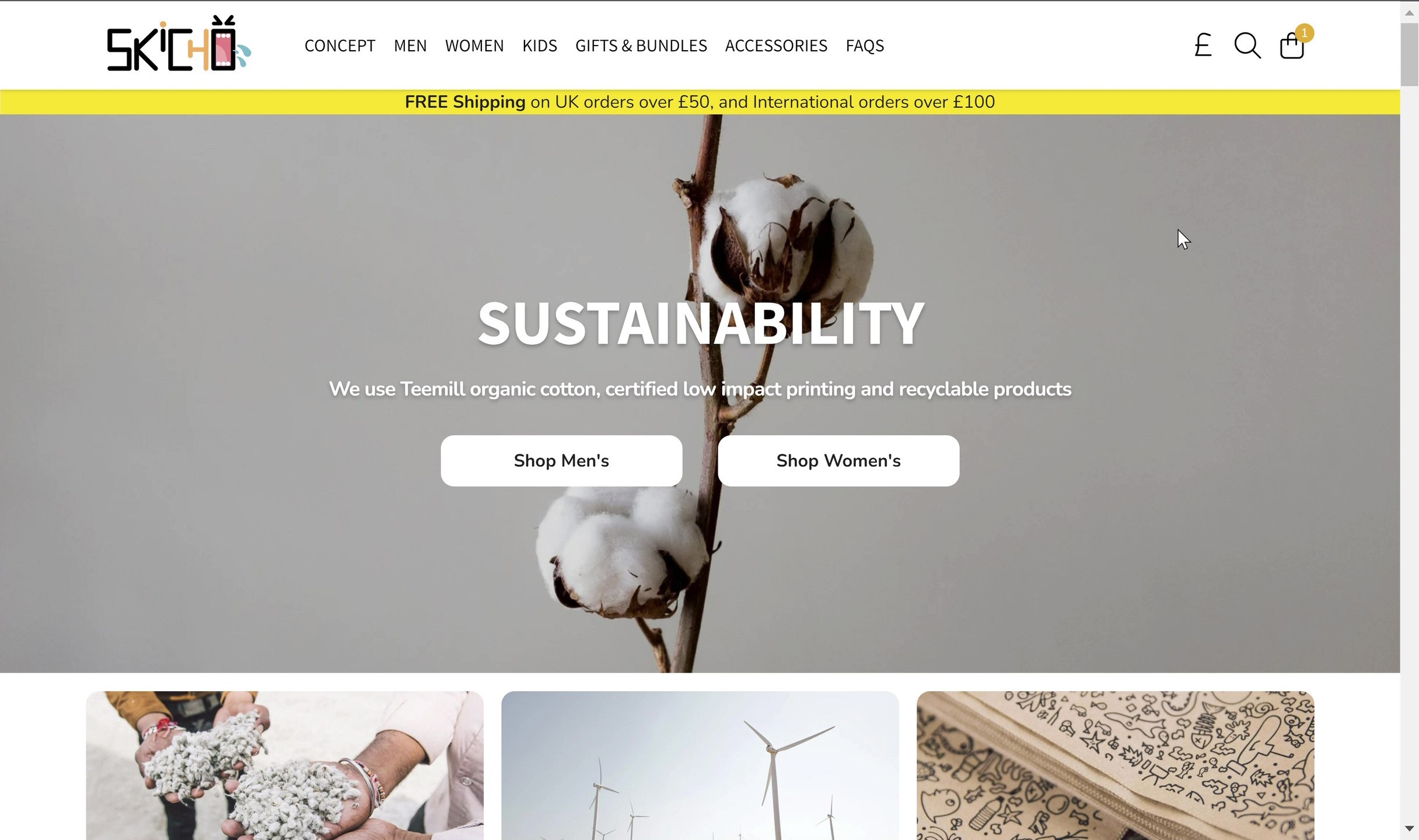
‣ Homepage design is dull and visually unappealing.
‣ Sustainability Certifications were difficult to find, leading to reduced credibility.
‣ Lack of product detailed images, making users question its quality and feel dissatisfaction with the display.
‣ Sustainability Page contained a load of information that was difficult to read/skim through, and was visually unappealing.
‣ Disturbed flow in navigation, some elements appeared to be clickable and a lack of action buttons caused frustration.
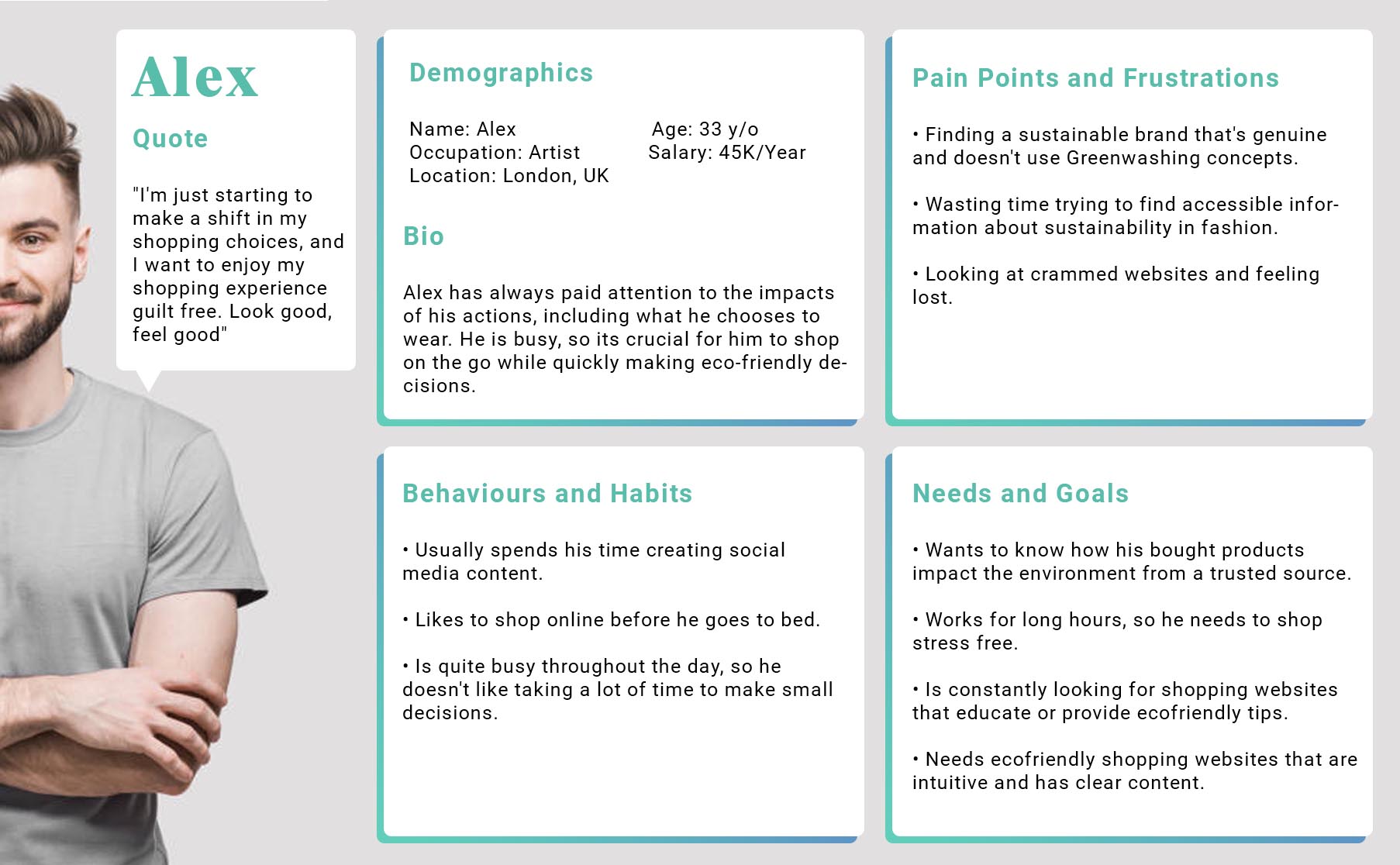
Qualitative Data (User Persona)
‣ Painkiller ( you can't shop without it): Buying products from trusted source.
‣ Vitamin (not essential but its valuable when present): Blogs, educational articles, etc
‣ Candy (things that if found, enhances the experience, if not, doesn't take from it): Getting store credits when joining a sustainable program.
Problem Statement
‣ There's a clear mismatch between the brand's identity and the visuals representing it.
‣ The perceived sustainability value that the brand is offering -which is also vital to the user- was not evident.
‣ Content on certain pages proved to be either uninteresting, disproportionate or untrustworthy.
‣ As a result, visuals were bland, findability of important information on the website was challenging > users bounced the second they landed.
Objectives of Study
‣ Establish a coherent brand identity and build a strong visual association to their sustainable values.
‣ Make sure the structure matches -to an extent- other similar fashion websites, as this contributes to the familiarity sense of the website.
‣ Reduce possible irrelevance or confusion throughout the process of web-surfing.
‣ Ensure the overall visuals are inviting and prompts users to explore.
How Might We..
‣ Design a homepage that is more engaging and relevant?
‣ Make the sustainability page more accessible and prominent?
‣ Increase instant credibility with customers?
‣ Rearrange elements/information to increase average time spent on page?
‣ Reduce frustration associated with unusual user flow?
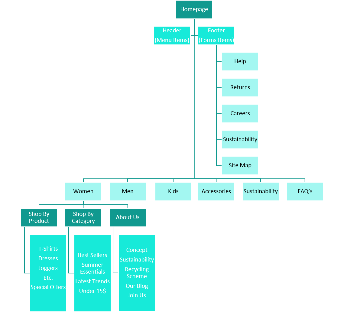
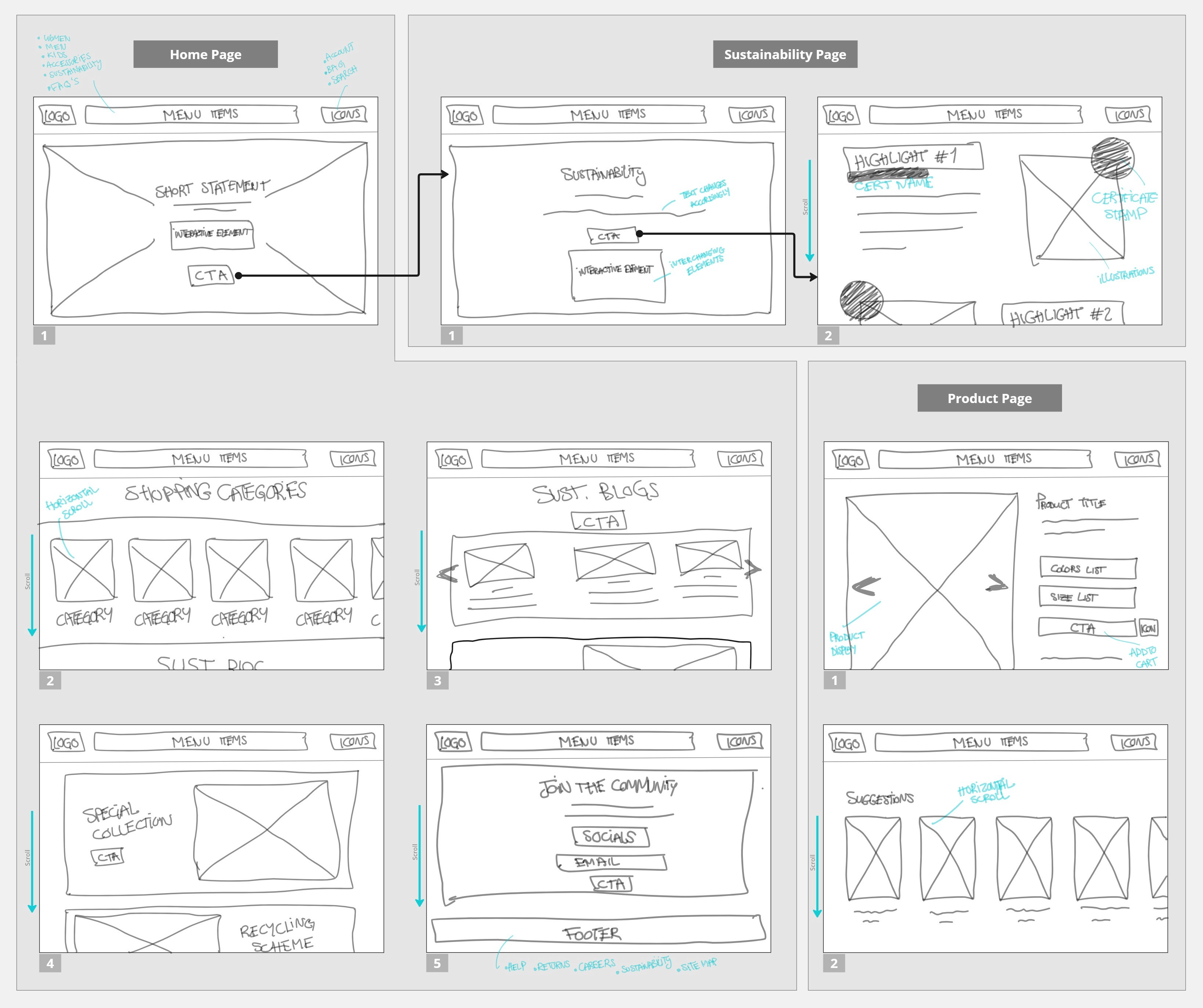
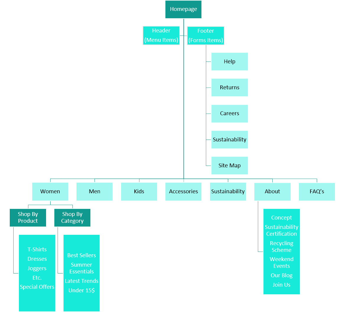
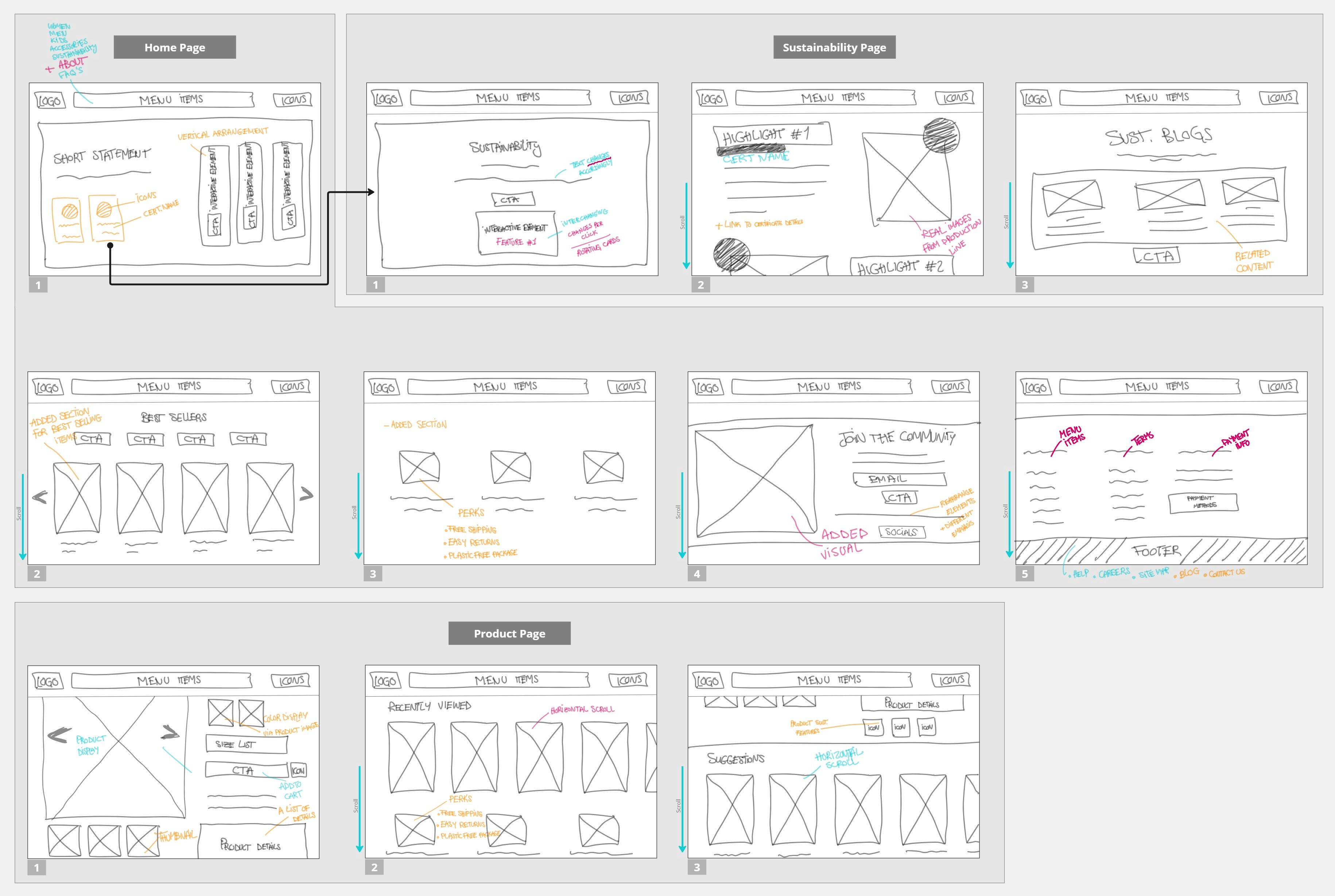
Site Map (Reconstructing The Mental Model)
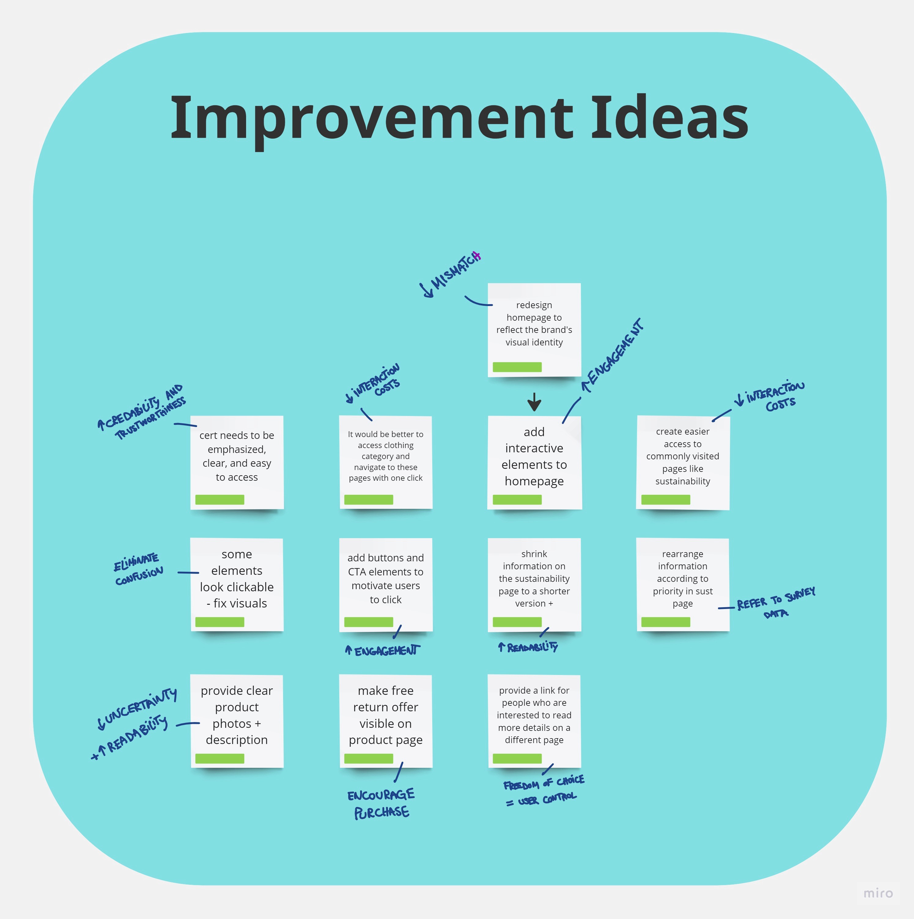
Design Decisions
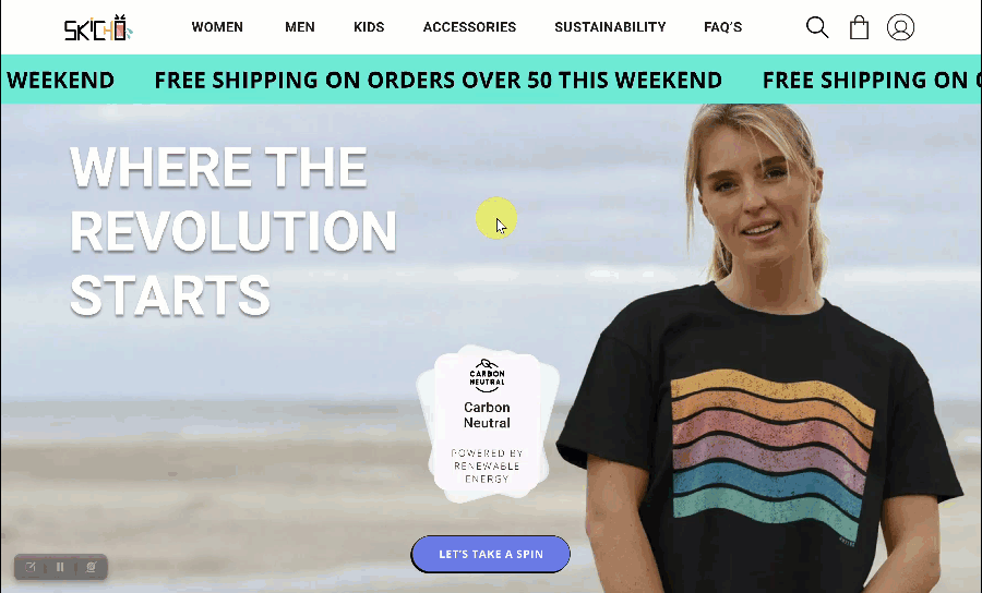
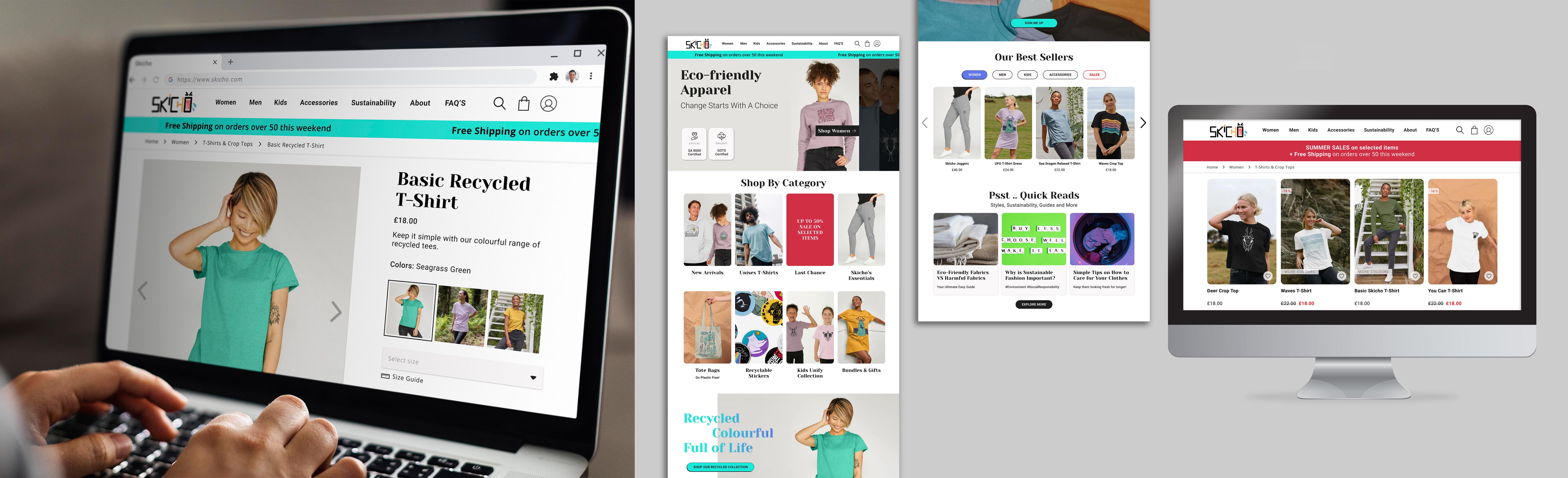
‣ Incorporate interactive features and CTA buttons on homepage, plus revamp to align with brand identity.
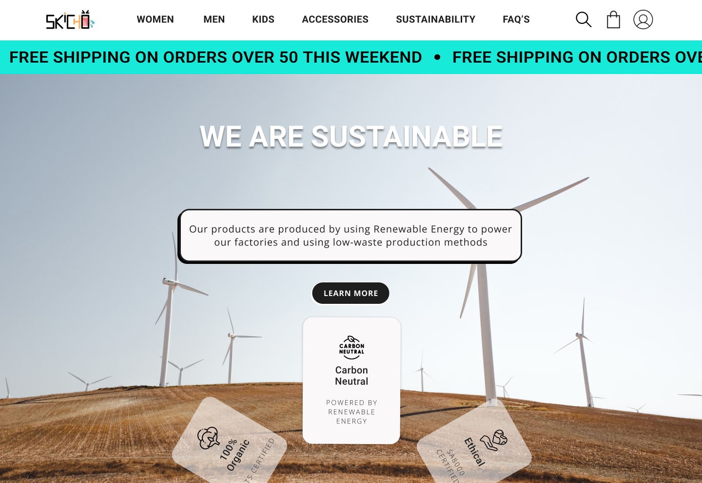
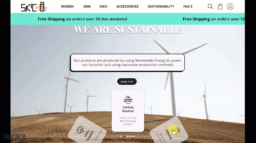
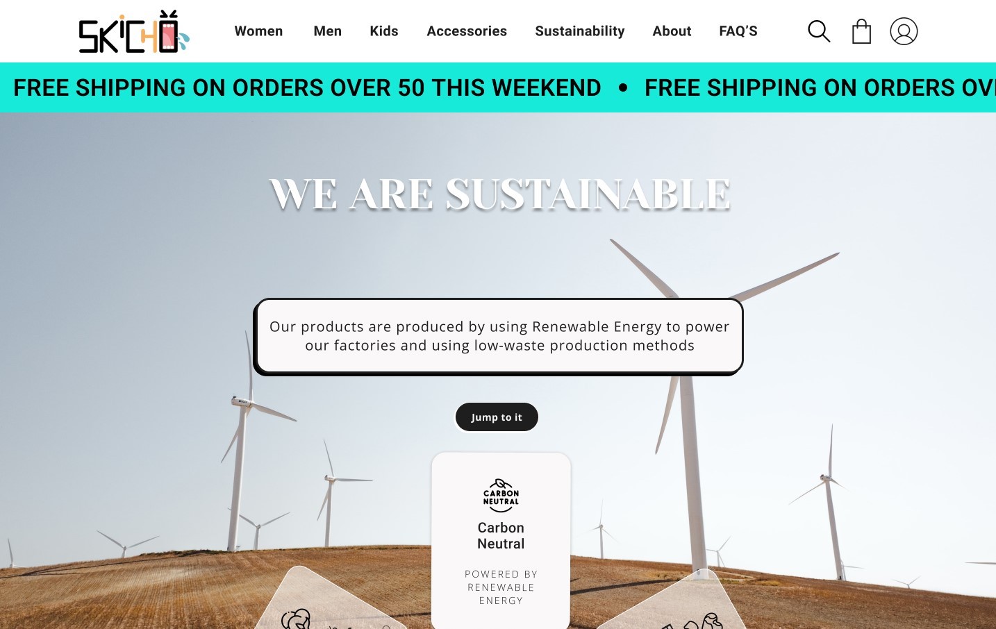
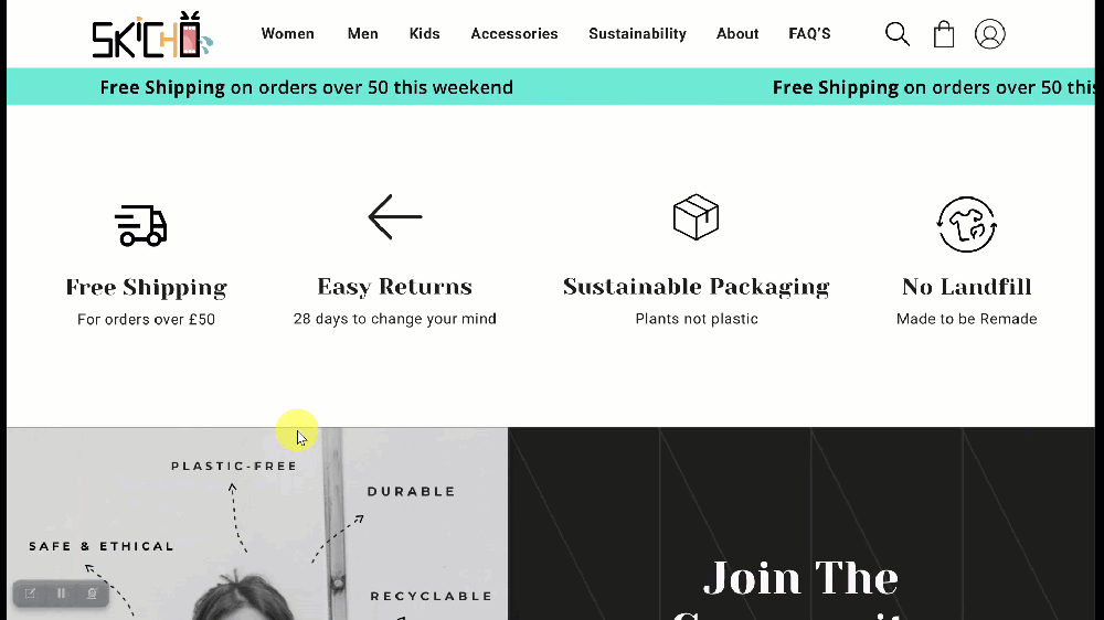
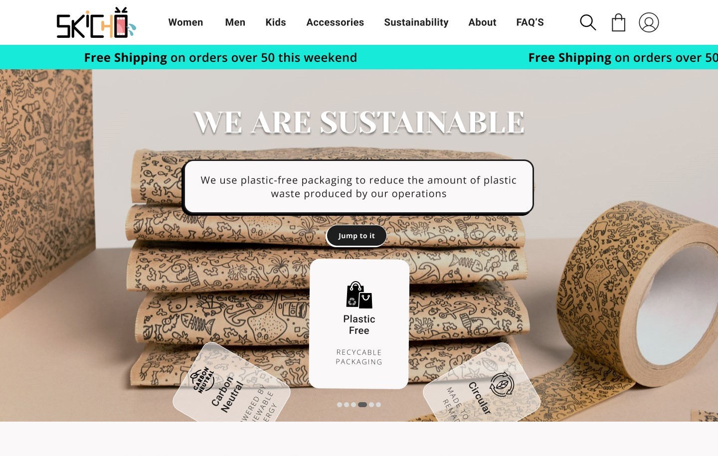
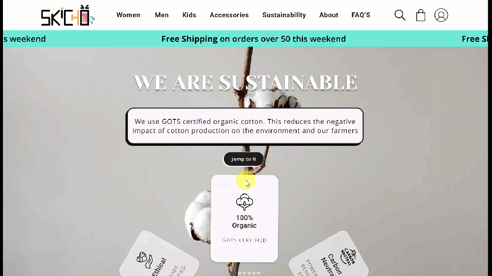
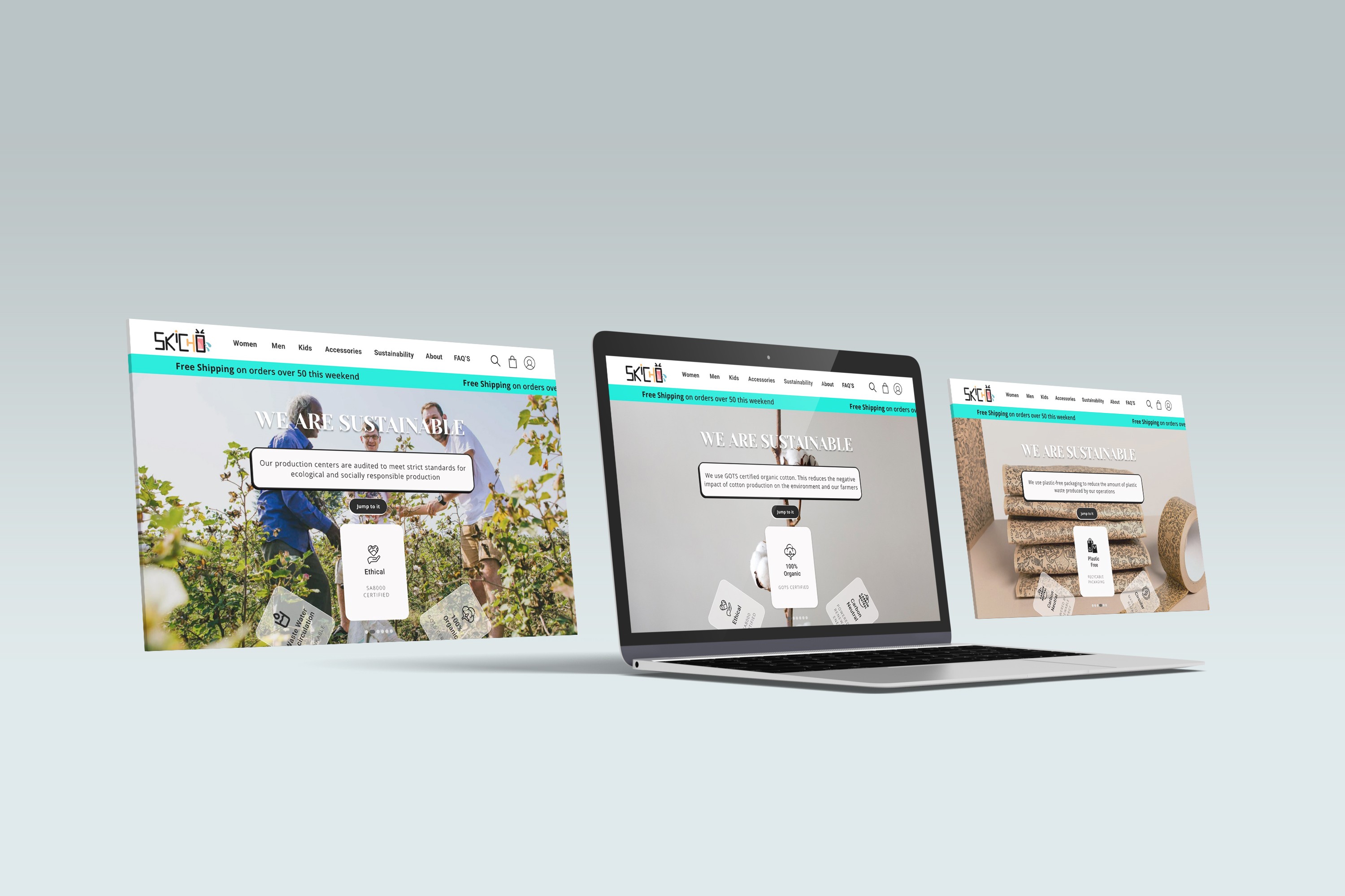
‣ Design the homepage with a quick sustainability overview + certifications, include a button linking to an in-depth page and a more prominent tab in the site navigation.
‣ Shorten details on sustainability page, provide briefs, and a read more option.
‣ Align navigation with users' mental models.
‣ Display sharp product photos from various angles and close-ups.
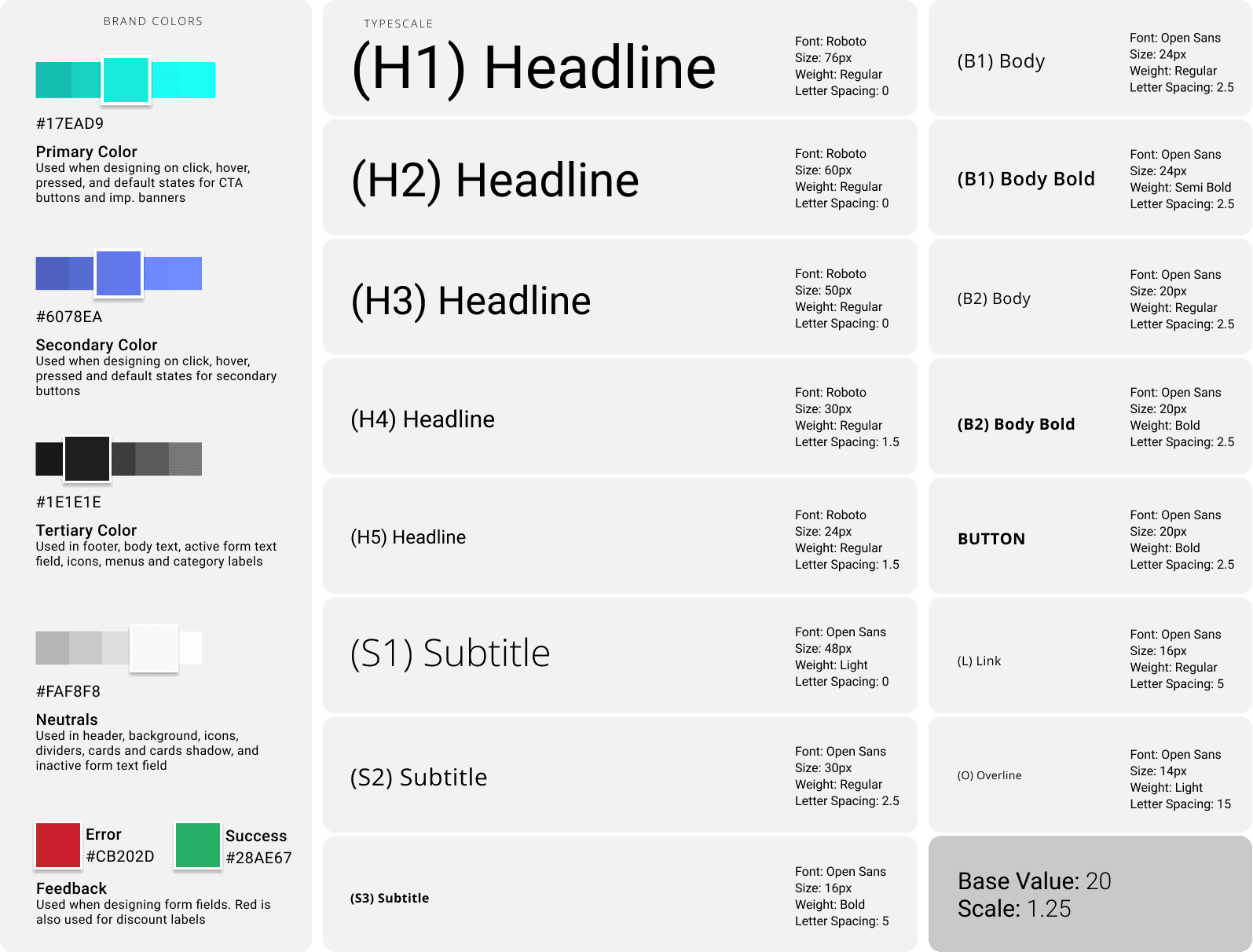
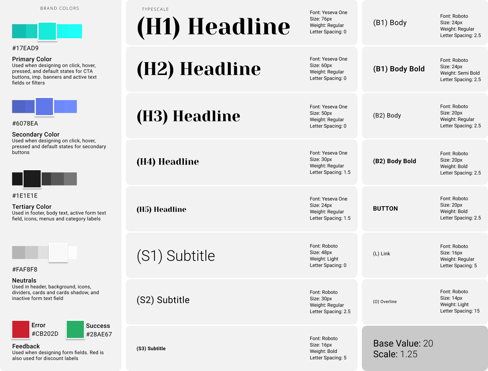
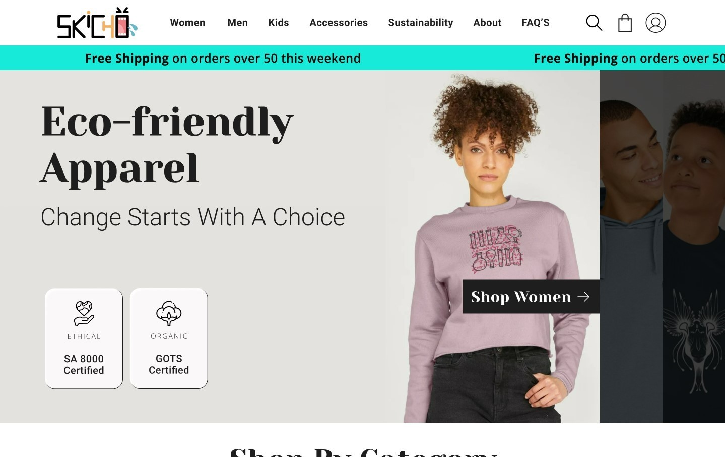
Visual Identity
‣ Turquoise: Green with blue undertone to reflect natural balance and serenity. Its striking comforting radiance makes it perfect for grabbing attention without being overly loud.
‣ Crayon Blue: Complements the soothing essence of the brand and conveys a sense of reliability and trust.
For typography measurements, I based the font size on a defined type scale (1.250 - Major Third), but still used an 8px system for the line height, which ensured a harmonious scale, pleasing for users and scalable for web development.
‣ Roboto Font: Clean style with sharp lines. Used for headlines and important titles.
‣ Open Sans Font: Found elsewhere for its clarity and readability.
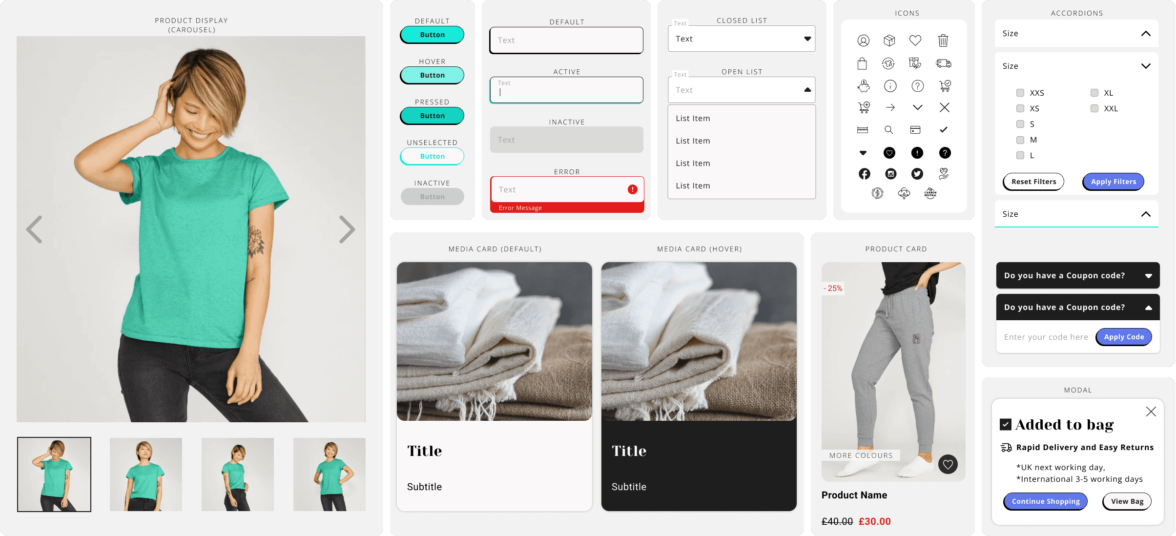
UI Components
I used the 8px grid system for the iconography. I sized them proportionally, with the height as a multiple of 8 (16px, 24px, 32px, and 48px). While the rest of the components' followed the grid system's lines.
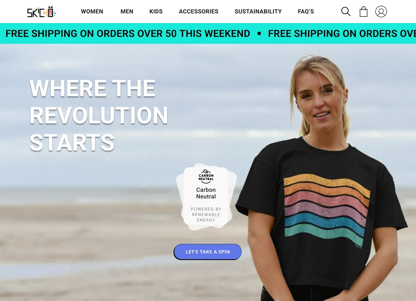
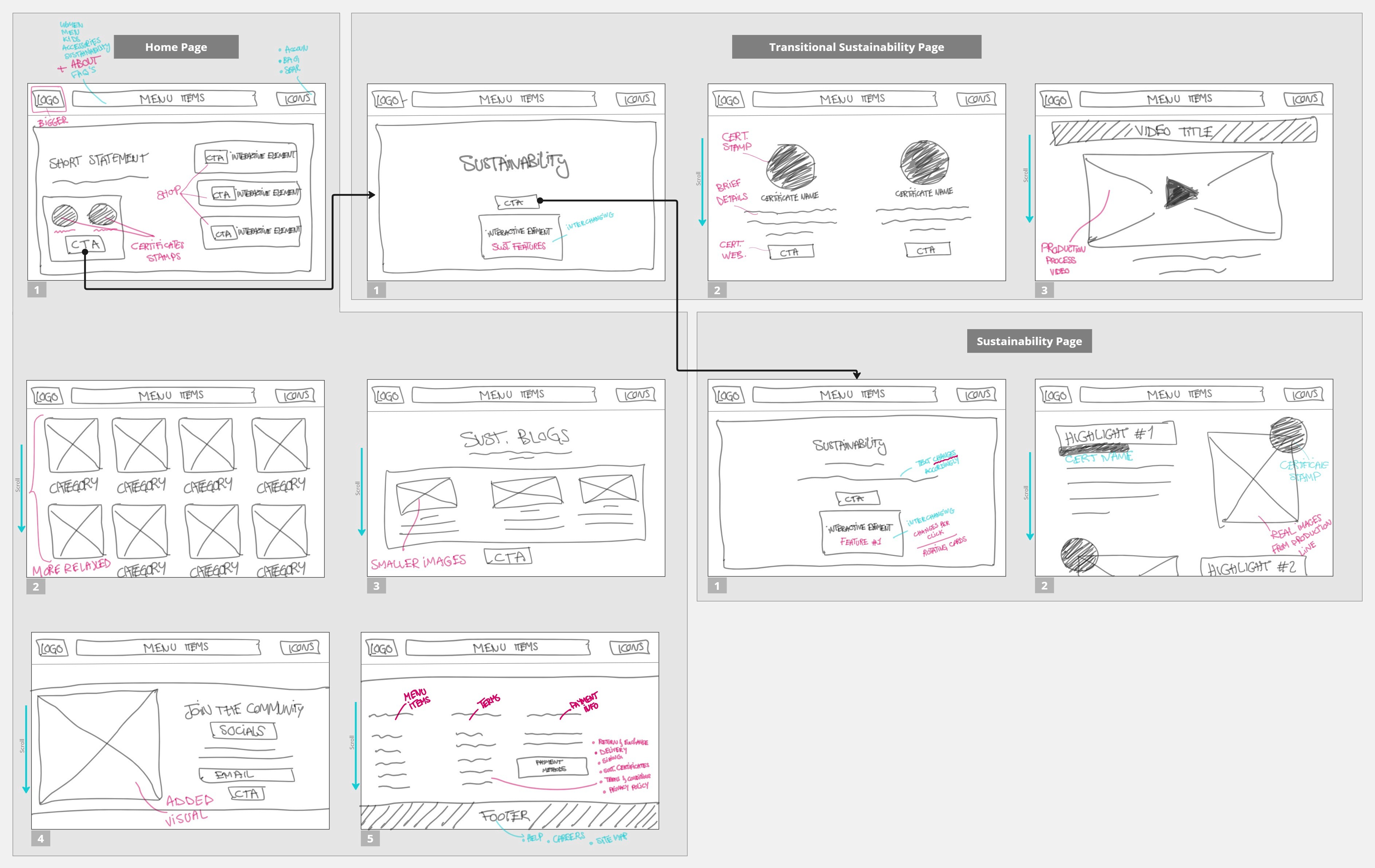
High-Fi Prototyping
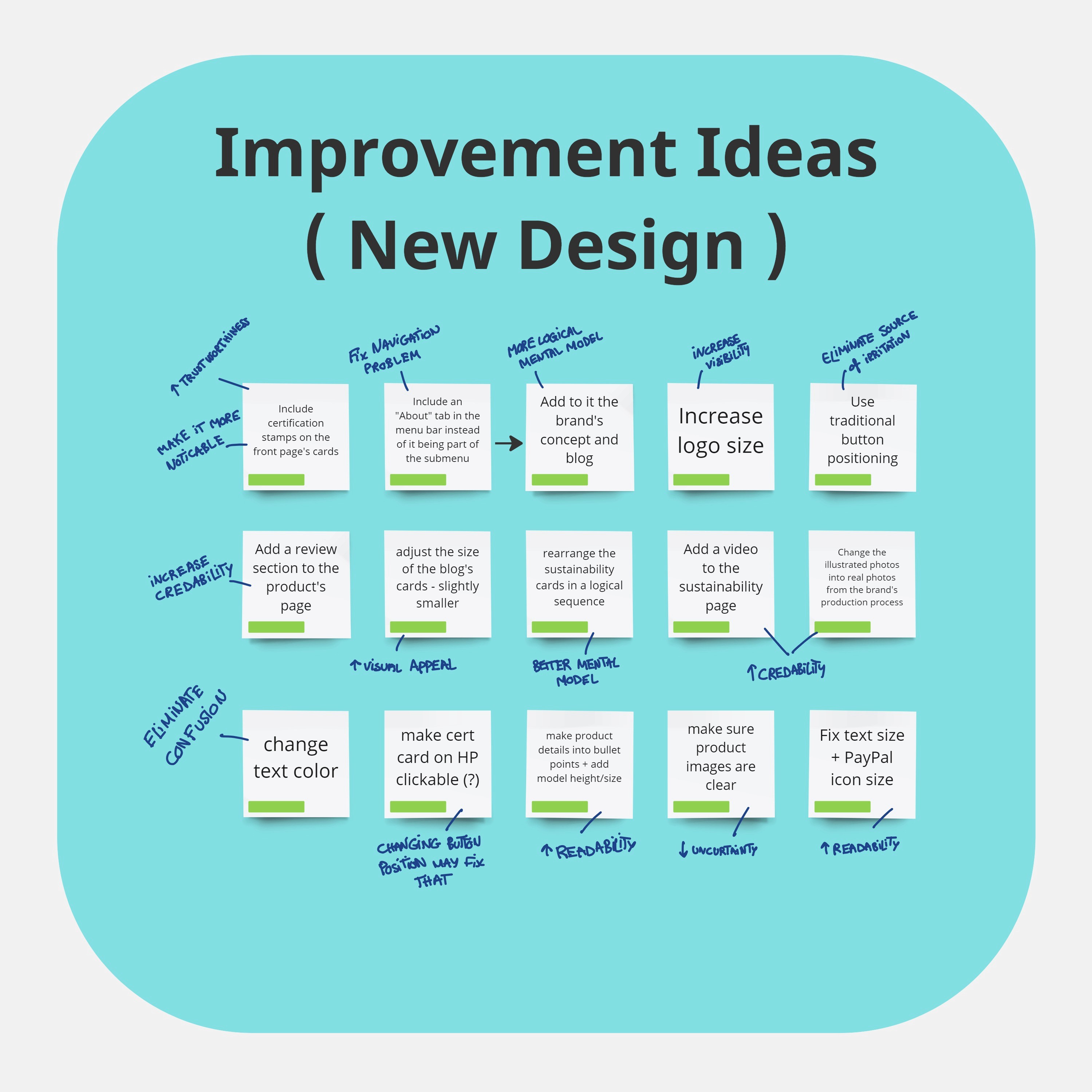
How Might We.. (Optimize)
‣ Design a homepage that is more appealing and speaks to brand?
‣ Explain sustainability certifications in layman terms?
‣ Decrease mental load from reading?
‣ Increase trust in the quality of the displayed product?
‣ Further reduce frustration associated with unusual user flow?
Site Map (Reconstructing The Mental Model)
Design Decisions
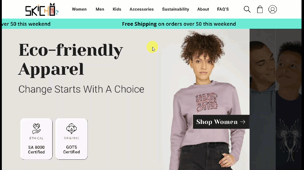
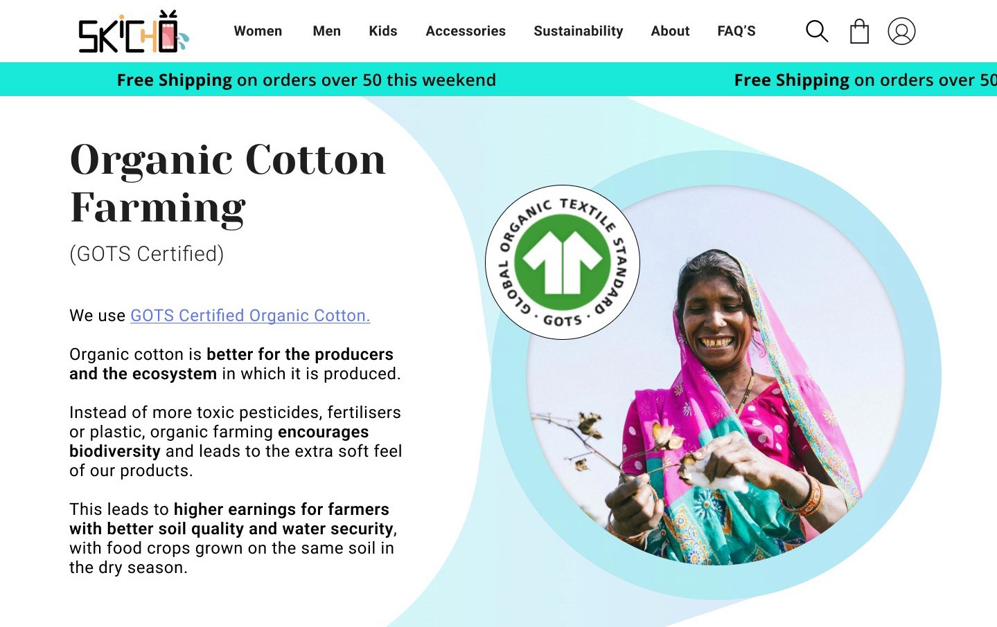
‣ Add certificate stamps to the hero on homepage and link it to a sustainability page with brief details about the certificates.
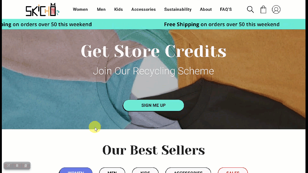
‣ Adjust the “Join the Community” section to match the brand’s visual identity and add a footer containing useful links.
‣ Add video for production process on sustainability page to increase credibility.
‣ reMatch navigation to the mental model of users, reposition some elements and eliminate confusion of clickable items.
‣ Add clear product photos from different angles and close-ups.
Visual Identity
‣ Yeseva Font: Used for headlines and important titles. An elegant and catchy font with soft edges that speaks to the friendliness of the brand.
‣ Roboto Font: Clean style with sharp lines, used for its clarity and readability.
Rejected
Reasons
‣ Adding a separate page to explain the sustainability certificates increases interaction costs.
‣ Users may forget to click on the interactive cards which takes them to the sustainability page, that's problematic due to its importance.
‣ Users may also be taken to a different website (certificates website) which can distract them from staying on this website, or again, forget to check the rest of the sustainability features unique to the brand.
Solutions
‣ Minimize interaction cost by eliminating this page.
‣ Transfer some of its good design elements to the sustainability page, such as the blogs.
‣ Below the sustainability features corresponding to the certificates, create a text link that gives the user the option to read more about it if interested.
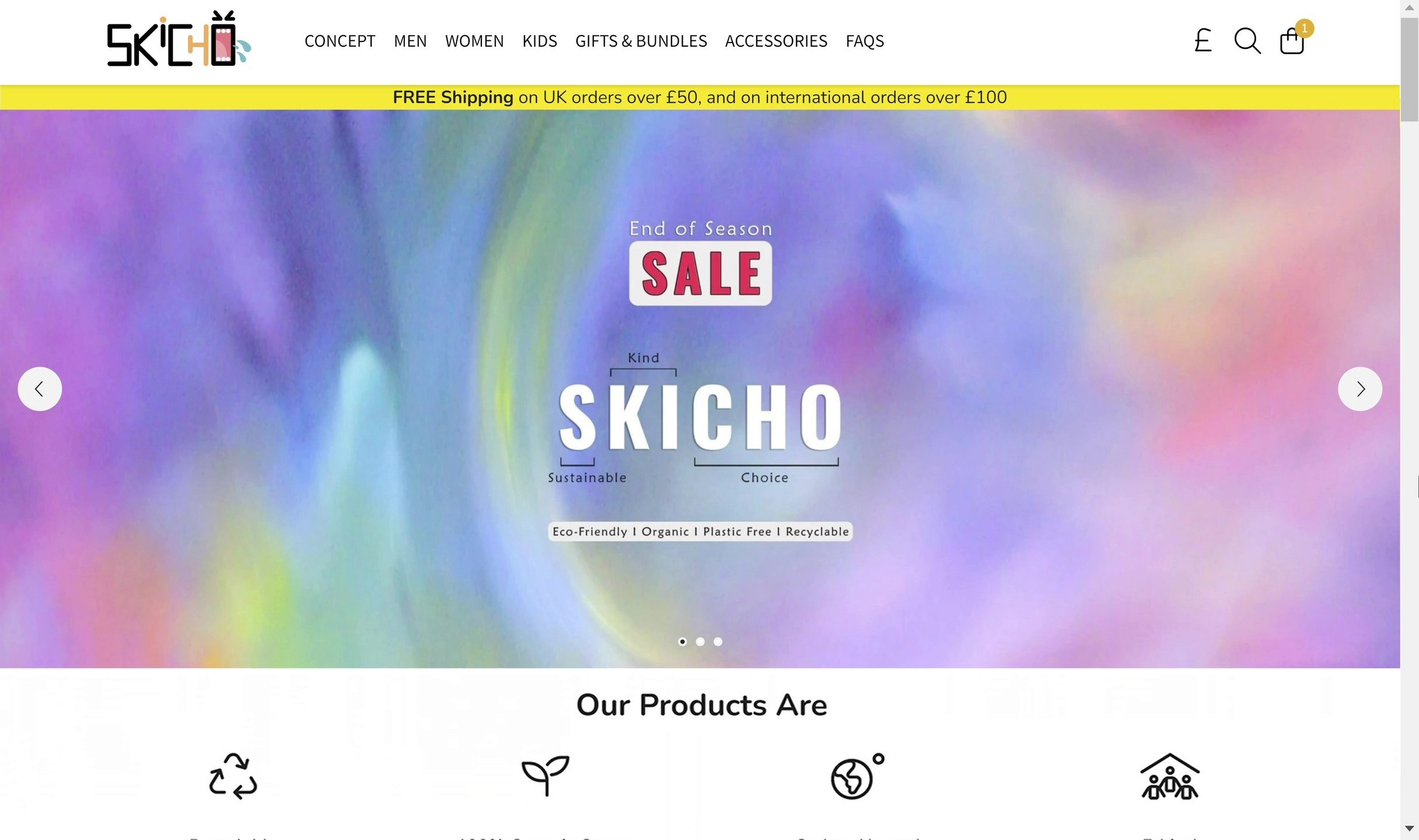
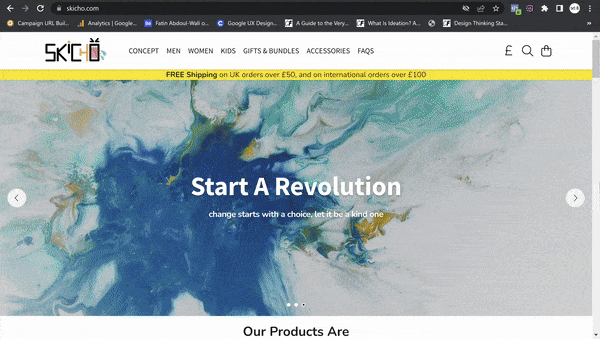
Updated Low-Fi Design
Final High-Fi Prototyping

Review
Salma Amer
Test User
Learnings
This project highlighted the importance of early usability testing in the design process for me. It provided a pathway for spending my time more effectively, helping me concentrate on the discovery of practical solutions based on real user feedback.
The experience taught me the value of adaptability and reiterated the need to constantly explore fresh concepts by revisiting and refining the research process in order to enhance the design.
Conclusion
The Skicho website redesign successfully addressed the usability issues, resulting in a more intuitive and user-friendly experience. The improved UX/UI design led to increased user engagement and satisfaction according to usability testing metrics, demonstrating the value of reiterating the research process and prioritizing user's feedback.